Brew Bros.
Branding May 2022
Brew Bros.
Branding May 2022
Brief
Passion project to create the branding for a coffee brand
Role
Designer for a passion project
About the Brew Bros.
Coffee, I think most people can not start their day without it. These two brothers sell all things coffee and taking it to the next level. They have been experimenting since day one to get their formula just right.
Now they need branding in order to share their love for coffee with the world.
Logo design
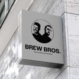
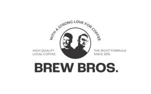
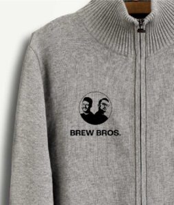
This brand is owned by two brothers, so it only seemed right to show personality in the brand by using them in the logo. To give off the rustic feeling of a stamp, they are placed in a circular shape – this also makes the brand mark easier to use.
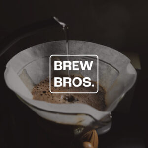
This brand mark is combined with a bold but slightly funky typeface called Roc Grotesk. This font is paired with Montserrat as secondary typeface.

Brand assets
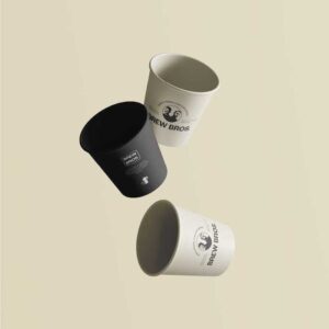
The packaging of retail product is challenging since there is so much competition. The packaging needs to have shelf presence, for it to stand out.
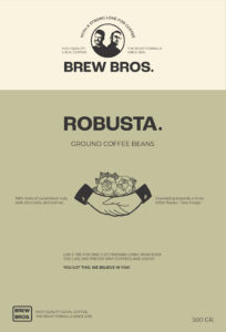
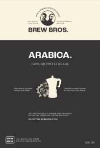
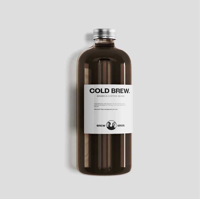
To reflect the rustic and bold atmosphere of the brand, I used bold labels and added interesting illustrations to the packaging. The packaging is simple, provides clear information, and reflects the brand.
Considering that the bros are just starting out, this packaging will be cheaper to produce while still accurately and aesthetically representing the brand and the brothers’ passion for coffee.
Often times, it is better to decide not to use many ornaments and go with the foundations and essentials of what makes good design. The same goes for this packaging design.


Coffee packaging
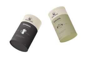
To keep the branding consistent and keep the rustic look, the packaging shows different traditional-tattoo-inspired illustrations. Each type of coffee will have a different illustration and a different background colour, for easy distinction between coffee types.
Letting the period from ‘Brew Bros.’ come back in the rest of the branding (i.e. by writing Robusta.), ties it all together.
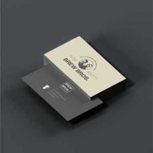
Of course, the primary logo and the secondary are also clearly visible on all packaging to make the brand easily identifiable.


Brand assets
The packaging of retail product is challenging since there is so much competition. The packaging needs to have shelf presence, for it to stand out.
To reflect the rustic and bold atmosphere of the brand, I used bold labels and added interesting illustrations to the packaging. The packaging is simple, provides clear information, and reflects the brand.
Considering that the bros are just starting out, this packaging will be cheaper to produce while still accurately and aesthetically representing the brand and the brothers’ passion for coffee.
Often times, it is better to decide not to use many ornaments and go with the foundations and essentials of what makes good design. The same goes for this packaging design.


Coffee packaging
To keep the branding consistent and keep the rustic look, the packaging shows different traditional-tattoo-inspired illustrations. Each type of coffee will have a different illustration and a different background colour, for easy distinction between coffee types.
Letting the period from ‘Brew Bros.’ come back in the rest of the branding (i.e. by writing Robusta.), ties it all together.
Of course, the primary logo and the secondary are also clearly visible on all packaging to make the brand easily identifiable.
