Coffee branding
The Hemingway
Branding Feb 2023
Brief
Project to create the coffee branding for a bookstore cafe + packaging design
Role
Designer for a passion project
About The Hemingway
Sometimes there is nothing better than going to a cafe to read a nice book while enjoying a warm cup of coffee or tea. Then, The Hemingway is the place to go because next to being a bookstore, they serve a mean cup of coffee. All in a very cosy atmosphere where you can really take some time to relax – or work.
Coffee brand logo
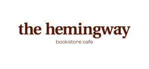
The primary logo for this brand is a bold serif from the ‘Utopia’ typeface. I decreased the kerning between the letters to make the logo appear more cosy. This is also the reason why I added ligatures between the letters m + i and a + y. It helps the word flow better and makes the logo appear more harmonious.
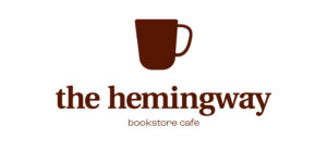
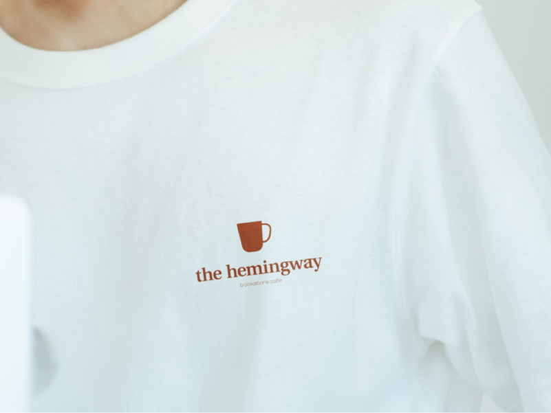
For the secondary logo, I added a coffee cup that also serves as a brand mark and can be found through the rest of the branding.
Cafe external & internal branding
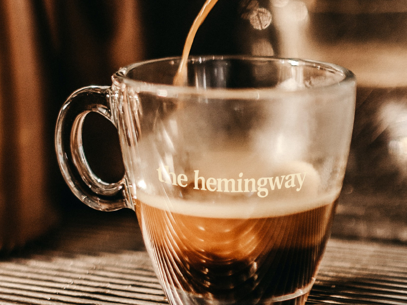
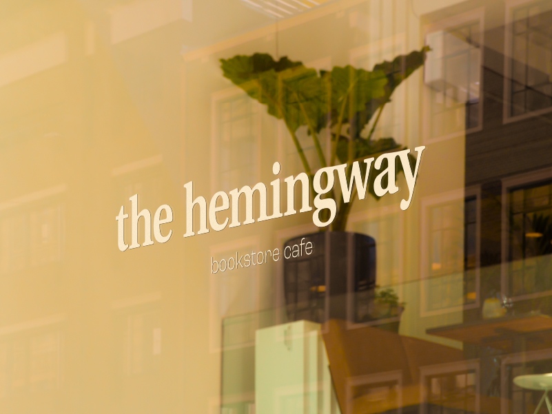
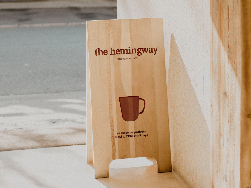
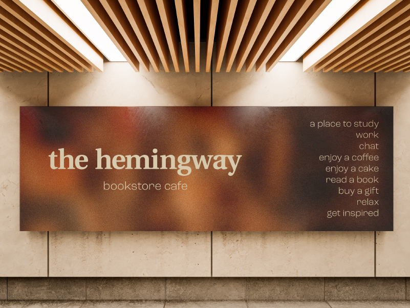
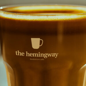
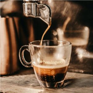
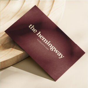
The art direction for this branding was to clearly communicate a cosy yet organised feeling. So the colour choice is centered around warm tones, with focus on dark orange/brown contrasted with a creamy beige. This can easily be translated in the cafe’s interior, for example by using wood – coffee and tea also have brown and red tones.
The brand uses simplistic visuals. Though every visual can stand alone and still be recognisable for the brand. From the colour palette, to the primary and secondary logos, to the photography direction, it all aligns.
Coffee packaging design & merch
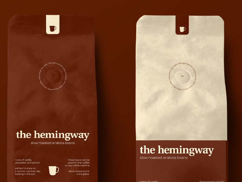
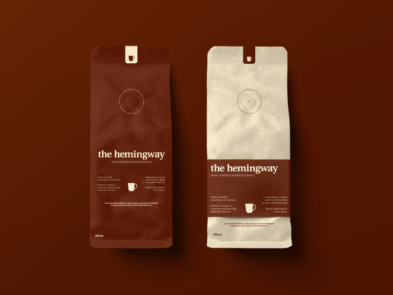
This cafe sells its own signature coffee. So the coffee branding would be incomplete without impactful packaging design. Of course the branding should clearly appear here again for it to be recognised everywhere.
With the signature colours at the centre, the packaging is eye catching. Combined with a simple, consistent lay-out that lists only the essentials in the brand tone of voice, the packaging is recognisable. Lastly, I added a label at the top that again shows the brand mark, making the packaging more easily distinguishable.



Coffee brand logo
The primary logo for this brand is a bold serif from the ‘Utopia’ typeface. I decreased the kerning between the letters to make the logo appear more cosy. This is also the reason why I added ligatures between the letters m + i and a + y. It helps the word flow better and makes the logo appear more harmonious.
For the secondary logo, I added a coffee cup that also serves as a brand mark and can be found through the rest of the branding.


Cafe external & internal branding
The art direction for this branding was to clearly communicate a cosy yet organised feeling. So the colour choice is centered around warm tones, with focus on dark orange/brown contrasted with a creamy beige. This can easily be translated in the cafe’s interior, for example by using wood – coffee and tea also have brown and red tones.
The brand uses simplistic visuals. Though every visual can stand alone and still be recognisable for the brand. From the colour palette, to the primary and secondary logos, to the photography direction, it all aligns.


Coffee packaging design & merch
This cafe sells its own signature coffee. So the coffee branding would be incomplete without impactful packaging design. Of course the branding should clearly appear here again for it to be recognised everywhere.
With the signature colours at the centre, the packaging is eye catching. Combined with a simple, consistent lay-out that lists only the essentials in the brand tone of voice, the packaging is recognisable. Lastly, I added a label at the top that again shows the brand mark, making the packaging more easily distinguishable.


Do you also have a project like this?
Let’s work together to bring your brand to life!


