Content Studio Brand Identity Design
Branding July 2025
Brief
Create the brand identity for a new content studio
Role
Designer and art director for client project
About Nowt Creative
Nowt Creative is a new content studio whose name is slang for “nothing”. The idea behind the name was a playful nod towards the brand’s ethos: humble, straight-talking, and grounded with real people and real stories.
Joe reached out to me to work on this smaller branding project so he could kickstart the brand’s launch.
It was important to Joe that we reflect the earlier mentioned brand pillars of humble, straight-talking, and grounded. So we preemptively decided to go for a super minimal design approach when it came to the logo concepts and to carry that throughout the rest of the brand too.
Joe
(owner of Nowt Creative)
“Iris at & the design delivered an amazing brand identity for my new business, including a logo, font pairing, colour palette and social media templates I can use going forward.
She was super easy to work with, understood my needs perfectly, communicated clearly, and the results were exceptional. I’m genuinely delighted with the outcome and would highly recommend her!”
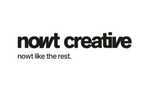
The logo
When going over the strategy, it became clear that minimalism was key for this brand identity, since it would accurately reflect the brand’s honest and purpose driven nature. We discussed options of going for a typography-led logo suite.
We also agreed that the brand has a unique side and therefore, the logo suite should reflect this as well. So overall creating a very minimal, typography-led brand with a nod to create that unique vibe.
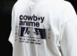
I did lots of iterations in different styles with different bold fonts that I felt were aligned with the brand’s vision. One of the concepts included a super simple, friendly font that was impactful. I skewed the ‘w’ and ‘v’ in order to create a feeling of reliability and trustworthiness but also has that creative nod we were looking for. This was the concept that the client loved, so I built on that to create the other concepts.
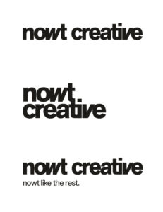
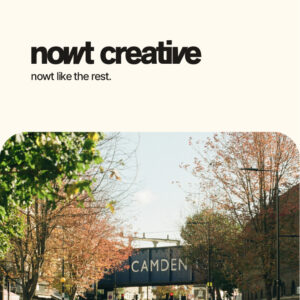
Complete logo suite
The rest of the logo suite came up quite easily as it was all based on the initial concept. We just wanted make sure the variations were all usable in different situations and clearly represented the brand. The client mentioned he probably wouldn’t need to use the variation with the tagline but I still added it to clearly demonstrate the type pairing as well.
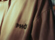
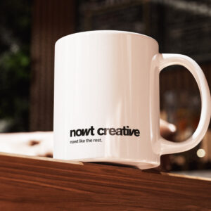
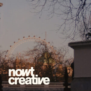
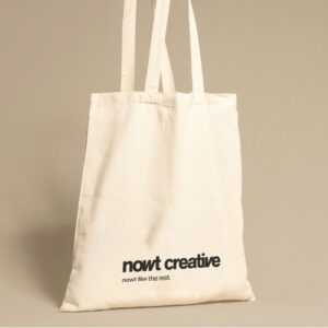
Misc design
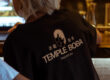
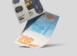
Whenever I deliver any form of branding, I always ensure to add enough misc to demonstrate the brand in real life situations. It’s a great way to also test if the concepts we made actually work as well.
With these brand application examples, I also give the client an idea of how to use the brand assets and how the minimal style is implemented in layouts and print materials for example. I often find it’s easier to understand when you show it instead of telling.


The logo
When going over the strategy, it became clear that minimalism was key for this brand identity, since it would accurately reflect the brand’s honest and purpose driven nature. We discussed options of going for a typography-led logo suite.
We also agreed that the brand has a unique side and therefore, the logo suite should reflect this as well. So overall creating a very minimal, typography-led brand with a nod to create that unique vibe.
I did lots of iterations in different styles with different bold fonts that I felt were aligned with the brand’s vision. One of the concepts included a super simple, friendly font that was impactful. I skewed the ‘w’ and ‘v’ in order to create a feeling of reliability and trustworthiness but also has that creative nod we were looking for. This was the concept that the client loved, so I built on that to create the other concepts.

Complete logo suite
The rest of the logo suite came up quite easily as it was all based on the initial concept. We just wanted make sure the variations were all usable in different situations and clearly represented the brand. The client mentioned he probably wouldn’t need to use the variation with the tagline but I still added it to clearly demonstrate the type pairing as well.
Misc design
Whenever I deliver any form of branding, I always ensure to add enough misc to demonstrate the brand in real life situations. It’s a great way to also test if the concepts we made actually work as well.
With these brand application examples, I also give the client an idea of how to use the brand assets and how the minimal style is implemented in layouts and print materials for example. I often find it’s easier to understand when you show it instead of telling.
Do you have a project in mind?
Let’s work together to bring your ideas to life! Email me at iris@andthedesign.nl or