Aware
Branding Nov 2022
Aware
Branding Nov 2022
Brief
Passion project for a jeans brand
Role
Designer
About the brand
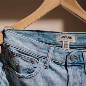
Jeans are some of the most iconic clothing items. Everyone has a pair they love. Though often times, it is very difficult to find that perfect pair. Aware makes that search easier for you. They offer durable jeans in all kinds of sizes, styles, and made of recyclable material.
They needed lasting and recognisable branding, that reflects their durable jeans.
Logo design
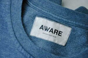
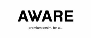
The logo is designed using the Helvetica typeface as basis and making slight adaptations to make it bolder. The ‘W’ is constructed using the typeface Bilo in bold and making slight adaptations for it to fit in with the Helvetica typeface.
The logo has a focus on the ‘W’ because it stands out in shape, with respect to the other characters. That is since the ‘W’ is also used as the brand mark.
Helvetica is paired with DIN typeface, with which the tagline is written.

Logo variations
In addition to the primary logo, I decided to create more logo variations. These could be used for marketing campaigns for example, to add more emphasis to the company’s vision and values.
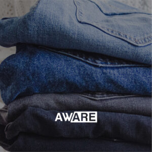
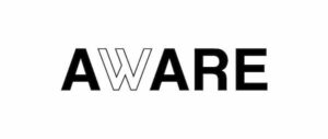
The first variation has a clear focus on the ‘W’ since it is the only character that is outlined. This represents that ‘we’ are the brand Aware. It is a brand that embraces its customers and genuinely wants to make them feel confident in their own skin.
A similar idea is conveyed in the second logo variation, where focus is applied to the ‘are’ at the end of the word. This again conveys that the audience is part of the Aware brand.

Packaging design
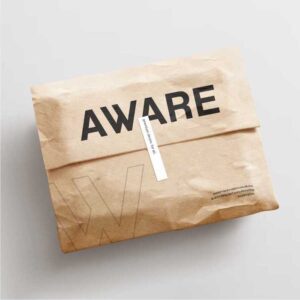
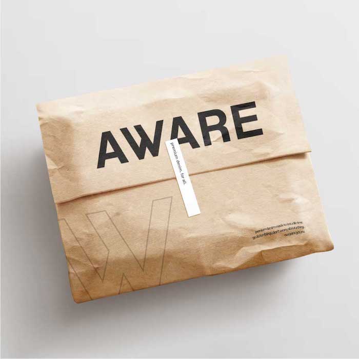
Since the brand uses recyclable materials, the shipping bag should also be made of paper. The bag first and foremost shows the primary logo in the middle. This is accompanied by the enlarged brand mark ‘W’ at the bottom.
There is also some body copy at the bottom right that represents the company’s values and vision. To let people live their life without worrying about things too much.
Lastly, to make the bag more unique, a sticker was added that spells out the tagline.
Logo variations
In addition to the primary logo, I decided to create more logo variations. These could be used for marketing campaigns for example, to add more emphasis to the company’s vision and values.
The first variation has a clear focus on the ‘W’ since it is the only character that is outlined. This represents that ‘we’ are the brand Aware. It is a brand that embraces its customers and genuinely wants to make them feel confident in their own skin.
A similar idea is conveyed in the second logo variation, where focus is applied to the ‘are’ at the end of the word. This again conveys that the audience is part of the Aware brand.


Packaging design
Since the brand uses recyclable materials, the shipping bag should also be made of paper. The bag first and foremost shows the primary logo in the middle. This is accompanied by the enlarged brand mark ‘W’ at the bottom.
There is also some body copy at the bottom right that represents the company’s values and vision. To let people live their life without worrying about things too much.
Lastly, to make the bag more unique, a sticker was added that spells out the tagline.
