Simplistic Coffee Brand
Branding & packaging June 2023
Brief
Passion project to create branding + packaging for a welcoming coffee brand
Role
Designer for a passion project
About Beyond Coffee
Beyond Coffee is more than just a coffee brand. Next to the fact that they go above and beyond to make the best coffee, they also want the coffee to make you feel warm and happy. Their coffee warms your soul.
The goal for this branding is to reflect the welcoming and easy going atmosphere that the brand wants to convey. For this, I went for a minimalistic art direction that focus on a fun aspect of the brand.
Coffee brand logo
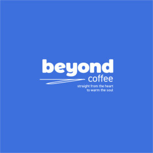
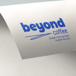
Since the brand has an easy going and welcoming atmosphere, I wanted the logo to reflect this as well. For this reason, I came up with a concept that allows for some customisation. The layout stays the same, with the logo + tagline, but some line work can be added. This makes every logo unique but still coherent with the brand.
To create the logo lockup, I used Montserrat Black for the word mark, which I rounded the corners of to give it a more friendly look. I paired this with DIN, since it’s known for its friendly look as well, due to its rounded features.
Cafe merch & brand collateral
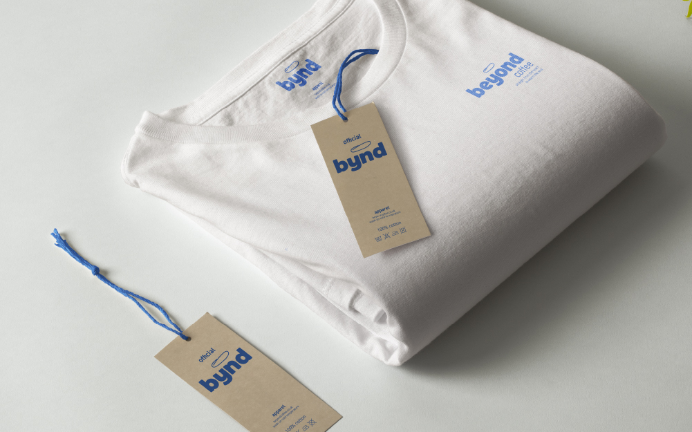
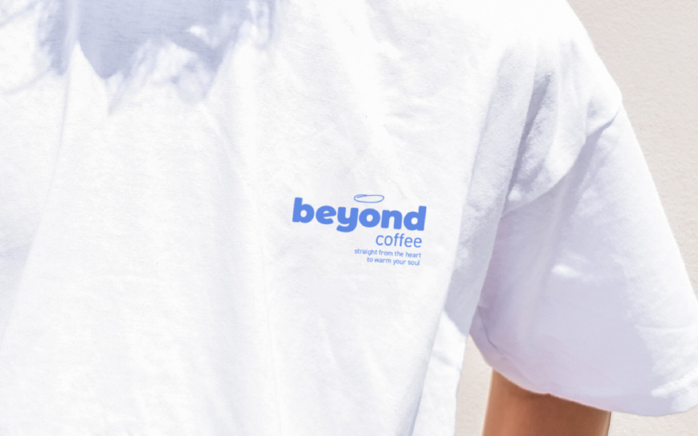
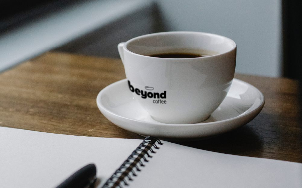
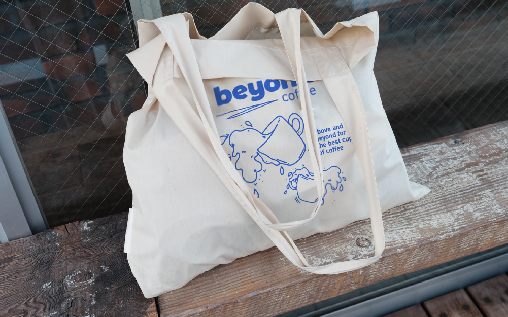
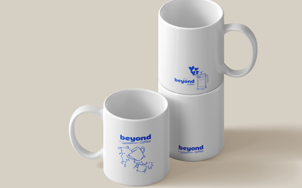
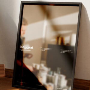
This coffee brand serves coffee straight from the heart and this feeling and idea should be visible in all their merch and collateral.
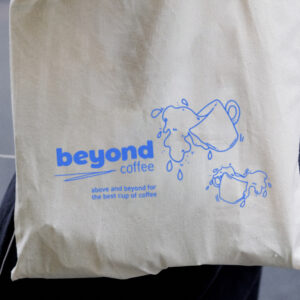
To convey the easy going and welcoming feeling, I incorporated illustrations. This not only ties everything together because there is line work in the logo lockup, but also adds to a more easy going look and feel.
Blue is one of the brand colours and helps to create a fresh feeling to the brand. Blue is combined with lots of white that again adds to a refreshing feeling. To create contrast, I used a dark brown colour, which represents the colour of coffee.
Coffee and cafe packaging
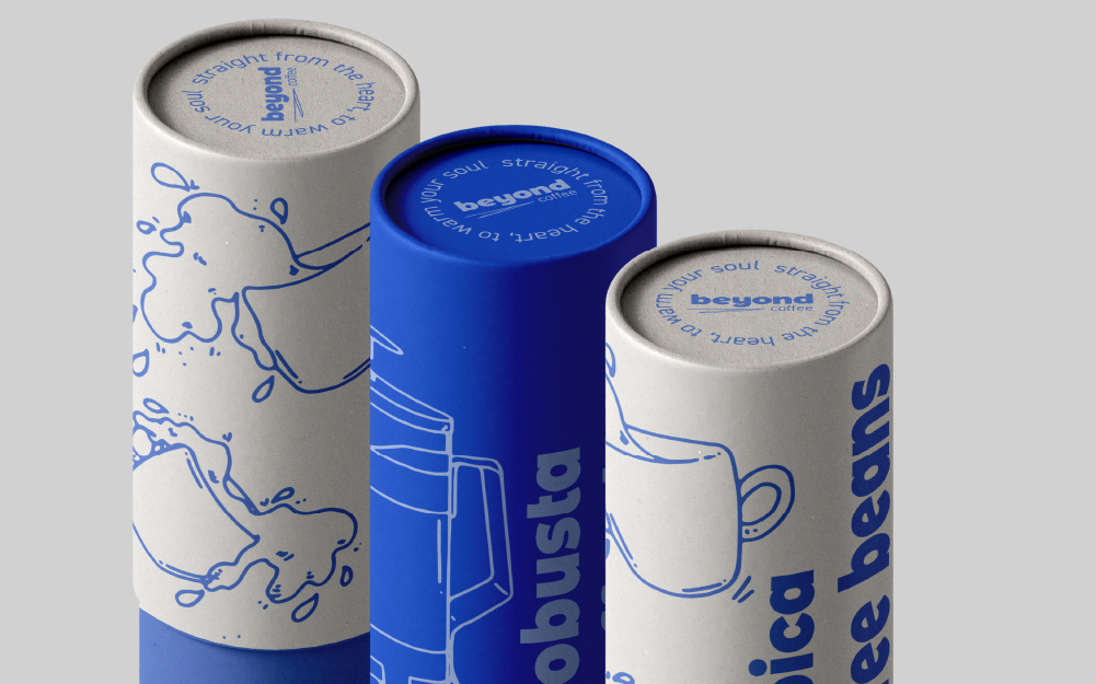
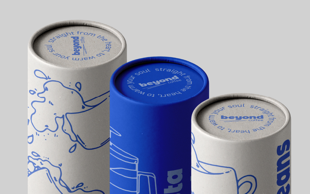
The distinct blue colour should be used evidently in all aspects of the brands, as such, it is also carried through in the coffee bean packaging. The coffee beans are stored in cylinders and depict different illustrations for the different types of coffee beans. In a large point size, the type of coffee bean is described, in the Montserrat Black typeface.
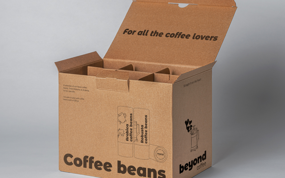
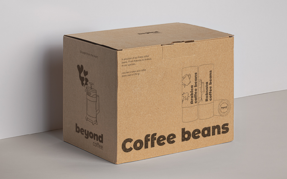
To ship a larger quantity of the coffee beans, there is also a shipping box. These again depict the illustrations found throughout the whole brand. It has a more minimalistic look while being clear in what the box contains and what the brand is. All in all, this creates a unique brand experience.



Coffee brand logo
Since the brand has an easy going and welcoming atmosphere, I wanted the logo to reflect this as well. For this reason, I came up with a concept that allows for some customisation. The layout stays the same, with the logo + tagline, but some line work can be added. This makes every logo unique but still coherent with the brand.
To create the logo lockup, I used Montserrat Black for the word mark, which I rounded the corners of to give it a more friendly look. I paired this with DIN, since it’s known for its friendly look as well, due to its rounded features.


Cafe merch & collateral
This coffee brand serves coffee straight from the heart and this feeling and idea should be visible in all their merch and collateral.
To convey the easy going and welcoming feeling, I incorporated illustrations. This not only ties everything together because there is line work in the logo lockup, but also adds to a more easy going look and feel.
Blue is one of the brand colours and helps to create a fresh feeling to the brand. Blue is combined with lots of white that again adds to a refreshing feeling. To create contrast, I used a dark brown colour, which represents the colour of coffee.


Coffee and cafe packaging
The distinct blue colour should be used evidently in all aspects of the brands, as such, it is also carried through in the coffee bean packaging. The coffee beans are stored in cylinders and depict different illustrations for the different types of coffee beans. In a large point size, the type of coffee bean is described, in the Montserrat Black typeface.
To ship a larger quantity of the coffee beans, there is also a shipping box. These again depict the illustrations found throughout the whole brand. It has a more minimalistic look while being clear in what the box contains and what the brand is. All in all, this creates a unique brand experience.


Do you also have a project like this?
Let’s work together to bring your brand to life!


