Anime Content Studio Branding
Branding Nov 2024
Brief
Create brand identity for an anime content creation studio
Role
Designer and art director for client project
About Cowboy Anime
Cowboy Anime is a new brand that has high potential and big goals. They reached out to me to work together on composing their visual identity since they would be launching soon.
The main idea the client had was that she wanted to really show her potential clients what the brand was about and so capture the brand’s essence in a more obvious way in the branding. It should be clear that it was all about anime but it shouldn’t be tacky and overly obvious.
Anastasia
(owner of Cowboy Anime)
“Working with Iris on the branding for my company, Cowboy Anime, was an absolute pleasure. She’s an amazing designer with a thoughtful, thorough approach. Our initial strategy session was incredibly valuable. Not only did it help her understand the brand on a deep level, but it also helped me clarify my own vision as a new business owner.
I would absolutely recommend working with Iris, whether you’re building a new brand or refreshing an existing one.”
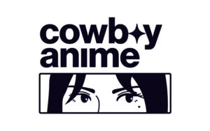
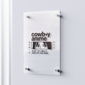
The logo
During strategy, we discussed the target audience, her goals, and her ideas at length. We especially covered lots of visual ideas she had in this session. She also explained the meaning behind the name of the brand and how she saw it as an underdog coming out on top concept. I thought there was lots of potential there. In the end, we wanted to show the ‘cowboy aspect in the logo but make it subtle and we agreed we wanted something illustrated there as well.
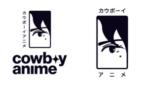
Complete logo suite
In the end, I came up with an illustration that gives a bit of a mysterious vibe (you don’t know what she’s looking at or thinking) and relates to the underdog idea: don’t know what to expect. I wanted to make this illustration completely integral to the brand so I created several variations of it so it could be used everywhere.

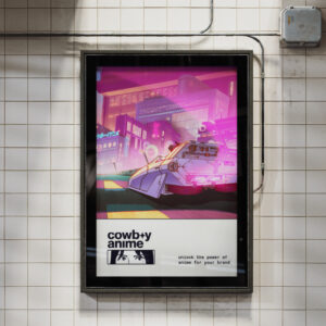
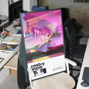
Misc design
As the eye concept is such an integral part of the branding, I focused on it a lot for the brand application.
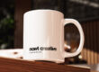
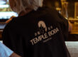
The business cards were an important touch point for the brand especially since the owner attends a lot of business events where lots of networking takes place. So I made sure to include an iconic layout that represented the brand identity as a whole. This was also the perfect opportunity to use different versions of the eye graphic. I designed it in a circular shape to ensure it can be used as profile picture and favicon. The idea to use this in slideshows and on things like business cards, ensured that the brand would always be recognised by just this small visual.
While working on the brand application, it became abundantly clear how important this particular visual became in the overall brand recognisability – the client fully agreed with this.


The collaboration
The thing that made this project so enjoyable and efficient, was close collaboration with the client where she was able to provide input and ideas because in the end, that’s what helped in creating these final concepts. And it was my job as a designer to take her ideas and mine to create a concept that would speak to her audience and what she wants to carry out. The outcome is Cowboy Anime as you see it here – branding that will grow as the brand grows where it can realise its potential.


The logo
During strategy, we discussed the target audience, her goals, and her ideas at length. We especially covered lots of visual ideas she had in this session. She also explained the meaning behind the name of the brand and how she saw it as an underdog coming out on top concept. I thought there was lots of potential there. In the end, we wanted to show the ‘cowboy aspect in the logo but make it subtle and we agreed we wanted something illustrated there as well.
Complete logo suite
In the end, I came up with an illustration that gives a bit of a mysterious vibe (you don’t know what she’s looking at or thinking) and relates to the underdog idea: don’t know what to expect. I wanted to make this illustration completely integral to the brand so I created several variations of it so it could be used everywhere.
Misc design
As the eye concept is such an integral part of the branding, I focused on it a lot for the brand application.
The business cards were an important touch point for the brand especially since the owner attends a lot of business events where lots of networking takes place. So I made sure to include an iconic layout that represented the brand identity as a whole. This was also the perfect opportunity to use different versions of the eye graphic. I designed it in a circular shape to ensure it can be used as profile picture and favicon. The idea to use this in slideshows and on things like business cards, ensured that the brand would always be recognised by just this small visual.
While working on the brand application, it became abundantly clear how important this particular visual became in the overall brand recognisability – the client fully agreed with this.
The collaboration
The thing that made this project so enjoyable and efficient, was close collaboration with the client where she was able to provide input and ideas because in the end, that’s what helped in creating these final concepts. And it was my job as a designer to take her ideas and mine to create a concept that would speak to her audience and what she wants to carry out. The outcome is Cowboy Anime as you see it here – branding that will grow as the brand grows where it can realise its potential.
Do you have a project in mind?
Let’s work together to bring your ideas to life! Email me at iris@andthedesign.nl or