Bloome Distillery
Branding Aug 2021
Bloome Distillery
Branding Aug 2021
Brief
Passion project to create an urban gin distillery’s branding and packaging design
Role
Designer for a passion project
About Bloome Distillery
There are a lot of alcohol brands out there. There is especially high competition in terms of design. For this reason, the goal of this branding project was to create branding and packaging design that is simple yet effective and luxurious.
It should stand out in its quality and unique design.
Logo design
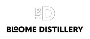
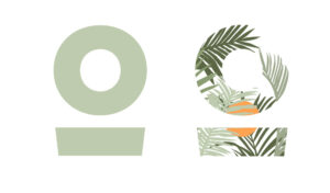
The logo design is inspired by the process of making gin. The ‘O’s different sizes create dynamic in the logo and simultaneously represent juniper berries, due to their different sizes, which is used to make gin.
The ‘L’ and ‘O’ become a sort of ligature which, in its isolated form, creates the brand mark.
Facade and banner design
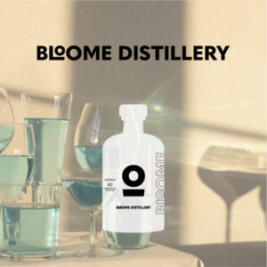
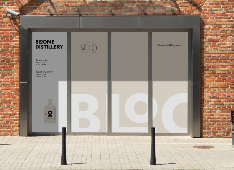
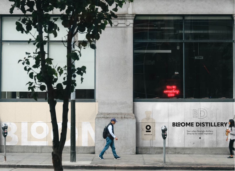
The distillery is an urban distillery which means they also need a shop. The facade needs to be in line with the rest of the branding – where it reflects the simplicity of the ingredients in a simple branding as well.
The use of colours is minimal and related to nature. The ideology of the brand is to use only natural ingredients. They mainly use floral scents that inspires them, to create unique gin flavours. For this reason, the branding for this gin, is also unique and unusual for a gin brand: very simple yet memorable.
Packaging design
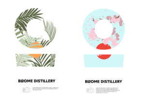
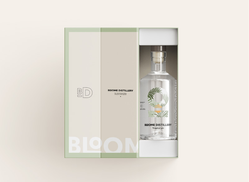
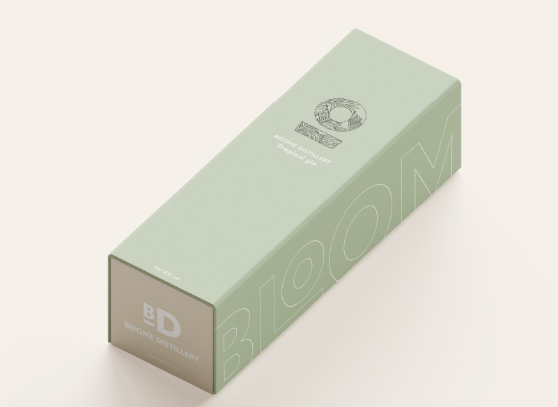
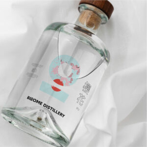
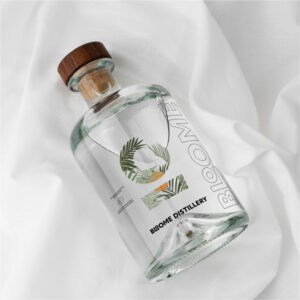
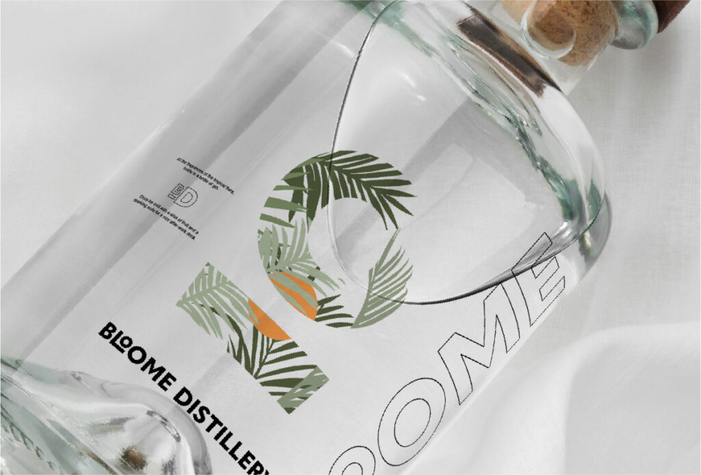
With an alcohol brand, the packaging can not be skipped. It is one, if not THE, most important aspect. To keep in line with the distillery’s approach to nature, the packaging has to reflect that very clearly. That is why I came up with the concept to use the brand mark as a mask for each gin flavour they have. If it is tropical, cherry blossom, or something else.
For each flavour, an illustration is made that presents the flavour. Then the mask of the brand mark is used and this icon will be the focal point of the packaging design. With this approach, you create uniqueness, but also maintain unity since the design layout and look will be the same – except for certain elements.


Logo design
The logo design is inspired by the process of making gin. The ‘O’s different sizes create dynamic in the logo and simultaneously represent juniper berries, due to their different sizes, which is used to make gin.
The ‘L’ and ‘O’ become a sort of ligature which, in its isolated form, creates the brand mark.


Facade and banner design
The distillery is an urban distillery which means they also need a shop. The facade needs to be in line with the rest of the branding – where it reflects the simplicity of the ingredients in a simple branding as well.
The use of colours is minimal and related to nature. The ideology of the brand is to use only natural ingredients. They mainly use floral scents that inspires them, to create unique gin flavours. For this reason, the branding for this gin, is also unique and unusual for a gin brand: very simple yet memorable.


Packaging design
With an alcohol brand, the packaging can not be skipped. It is one, if not THE, most important aspect. To keep in line with the distillery’s approach to nature, the packaging has to reflect that very clearly. That is why I came up with the concept to use the brand mark as a mask for each gin flavour they have. If it is tropical, cherry blossom, or something else.
For each flavour, an illustration is made that presents the flavour. Then the mask of the brand mark is used and this icon will be the focal point of the packaging design. With this approach, you create uniqueness, but also maintain unity since the design layout and look will be the same – except for certain elements.
