Juice Bar Branding
Branding May 2024
Brief
Create a complete brand identity for a juice bar
Role
Designer and art director for client project
About Bubbleboy
Bubbleboy is a new juice bar in Hamilton, New Zealand. It’s perfect for all those that value health – so the majority of the customers are those that often visit the gym and want to replenish their energy with a healthy drink after a gym session.
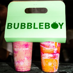
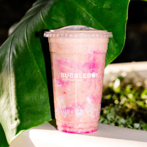
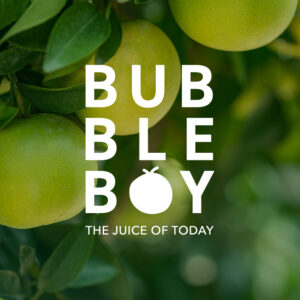
The logo
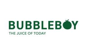
During strategy, we discussed ideas for the brand that are in line with the target audience and goals of the brand, as well as the overall vision. One of the main things we wanted to focus on was to exude a vibrant feeling that makes the customers feel energetic, before they’ve even had the juice. The branding should convey this in the overall look & feel. Next to that, we wanted it to be modern but also give off a marketplace feeling to make it look more organic in more ways than one.
After going to the drawing board to design logo ideas, I presented the client with the idea of replacing the ‘o’ with a fruit – an orange. In this case, it looks like an orange but also a little boy, this being a visual representation of the brand name. The small graphic itself was made to look more organic as well.
I manipulated the brand font a bit by making the characters a bit rounded so that it looks friendlier and more approachable.
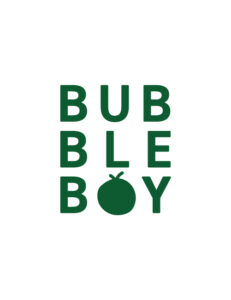
For the secondary logo, we decided the stacked version would be perfect because that was inspired by signage in the marketplace. Thus giving that organic feeling.
Dynamic logo suite
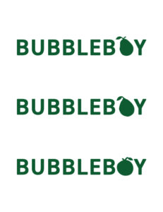
The brand is modern, fun, and approachable. I wanted to translate this concept in the fact that the ‘o’ could be replaced by different fruits as well. That way, the brand becomes very dynamic while still being entirely recognisable as Bubbleboy.
This concept can be used for different campaigns and to create different faucets of the brand as whole. The different variations we came up with so far were to replace the ‘o’ with a pear, lemon, and an apple.
Art direction


Illustration concept
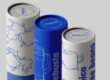
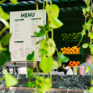
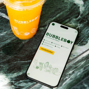
To complete the art direction, we complimented the branding with a set of assets which included illustrations of the most used juice ingredients. The brand assets would be used on the cup, the menu, merchandise, and website.
We agreed that the illustrations should look more organic and hand drawn in order to fall in line with the overall art direction. So I drew them by hand and vectorised them.


The logo
During strategy, we discussed ideas for the brand that are in line with the target audience and goals of the brand, as well as the overall vision. One of the main things we wanted to focus on was to exude a vibrant feeling that makes the customers feel energetic, before they’ve even had the juice. The branding should convey this in the overall look & feel. Next to that, we wanted it to be modern but also give off a marketplace feeling to make it look more organic in more ways than one.
After going to the drawing board to design logo ideas, I presented the client with the idea of replacing the ‘o’ with a fruit – an orange. In this case, it looks like an orange but also a little boy, this being a visual representation of the brand name. The small graphic itself was made to look more organic as well.
I manipulated the brand font a bit by making the characters a bit rounded so that it looks friendlier and more approachable.
For the secondary logo, we decided the stacked version would be perfect because that was inspired by signage in the marketplace. Thus giving that organic feeling.

Dynamic logo suite
The brand is modern, fun, and approachable. I wanted to translate this concept in the fact that the ‘o’ could be replaced by different fruits as well. That way, the brand becomes very dynamic while still being entirely recognisable as Bubbleboy.
This concept can be used for different campaigns and to create different faucets of the brand as whole. The different variations we came up with so far were to replace the ‘o’ with a pear, lemon, and an apple.
Art direction
Illustration concept
To complete the art direction, we complimented the branding with a set of assets which included illustrations of the most used juice ingredients. The brand assets would be used on the cup, the menu, merchandise, and website.
We agreed that the illustrations should look more organic and hand drawn in order to fall in line with the overall art direction. So I drew them by hand and vectorised them.
Do you have a project in mind?
Let’s work together to bring your ideas to life! Email me at iris@andthedesign.nl or