Kodak packaging design
Branding & packaging Jan 2024
Brief
Passion project to redesign Kodak packaging
Role
Designer for a passion project
About Kodak
Kodak is one of the main brands when it comes to film. Any analogue photography lover will know them. I love their packaging but I wanted to try my hand at redesigning it in a more modern way, focused on typography.
The goal is, to make this packaging design impactful, bold, and speak to the film lovers.
Approach
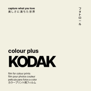
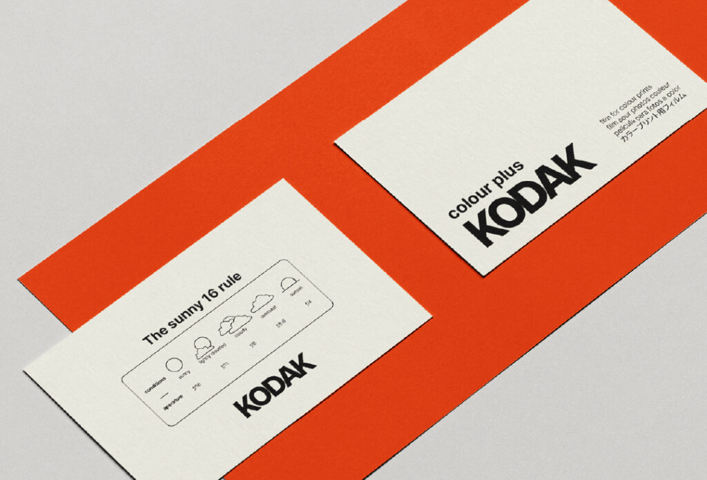
For this redesign, the focus is on strong typography and layout, using a plain colour palette that already resonates with Kodak.
The typeface that was used is Pretendard. It is a strong typeface with many different fonts. I adjusted the tracking so the letters are closer together in the logo, giving it a slightly more artsy and modern feeling.
Packaging design
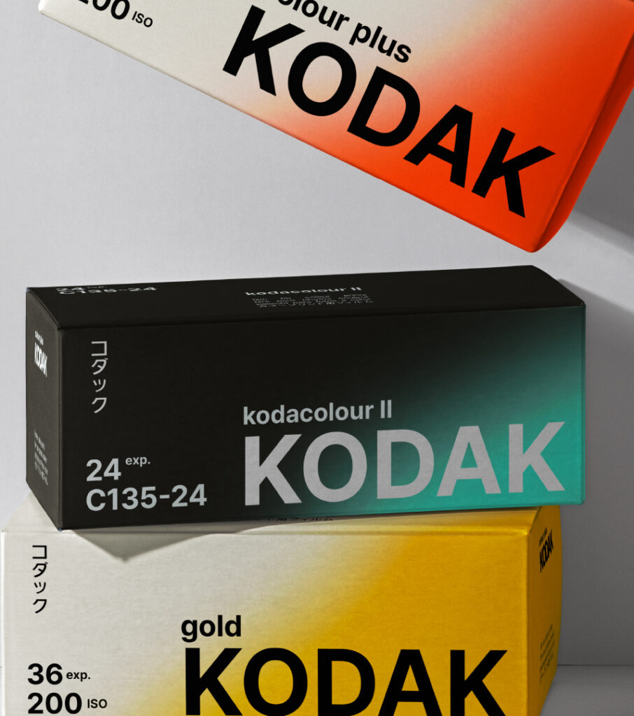
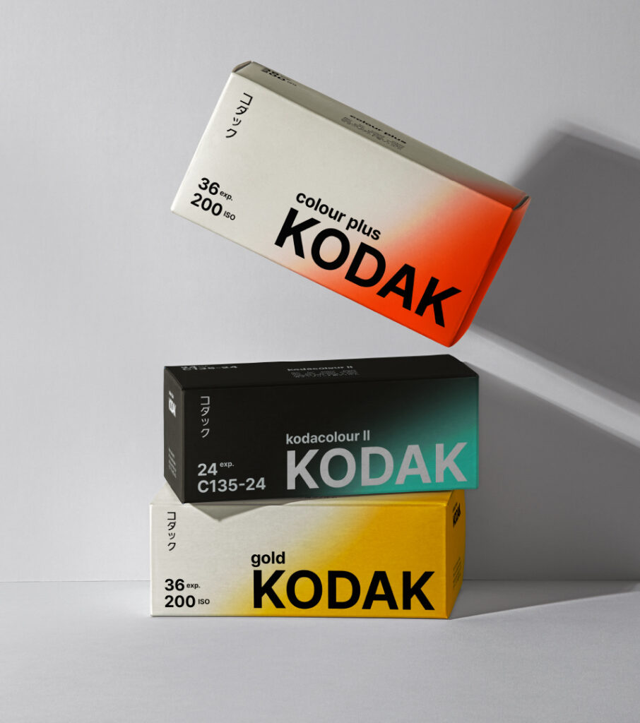
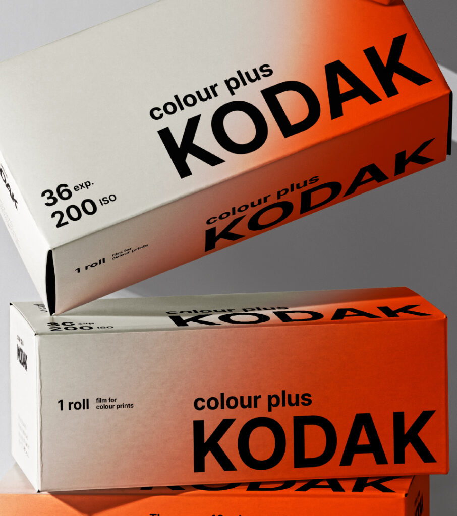
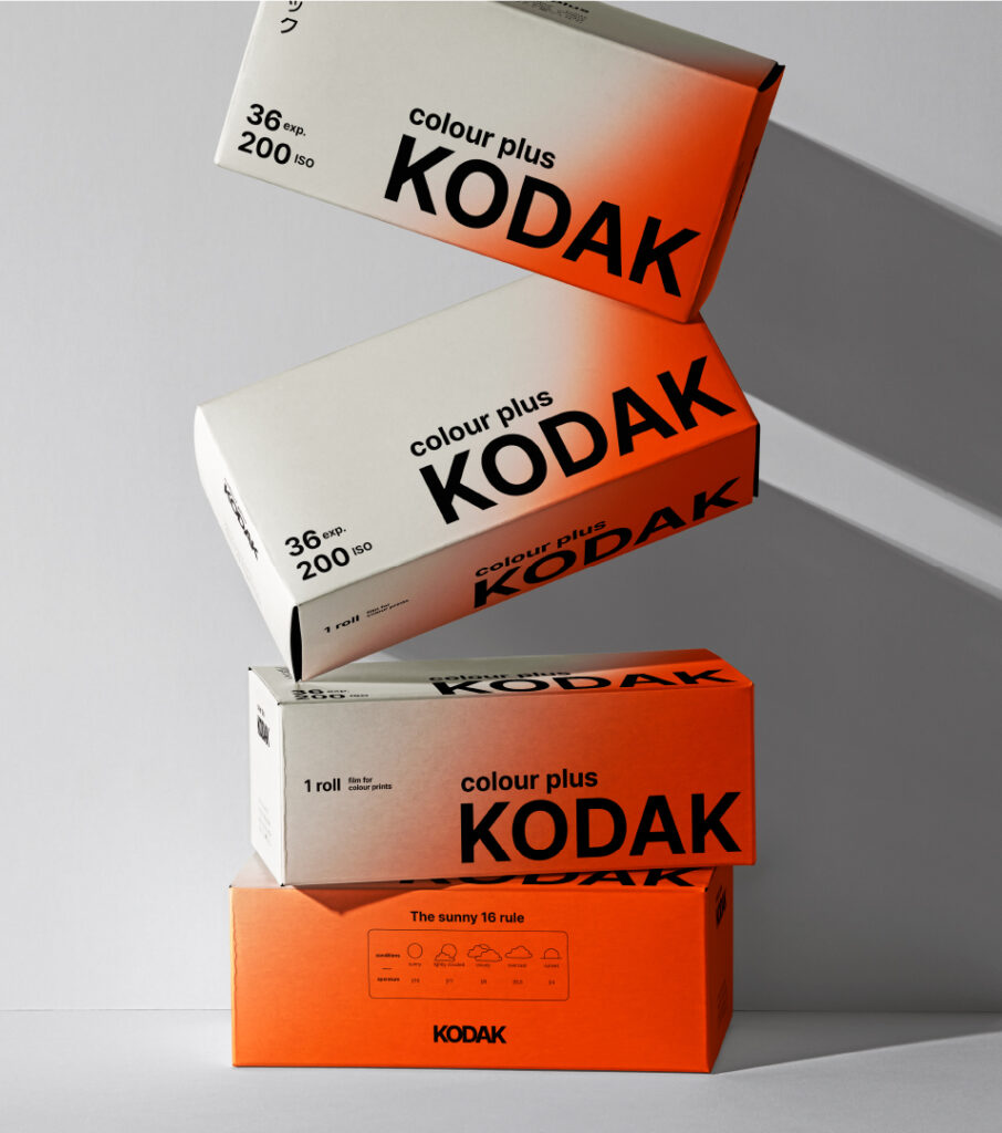
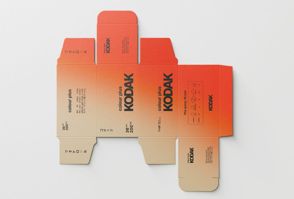
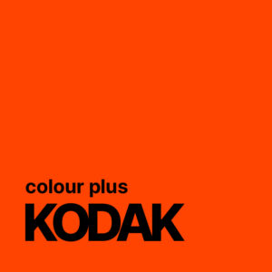
The first thing you will see on the box is an orange blur. This is inspired by light leaks that are very present in film photography. It is a strong visual cue to this while being subtle at the same time.
Every type of film will have a different colour blur to distinguish the different types.


Approach
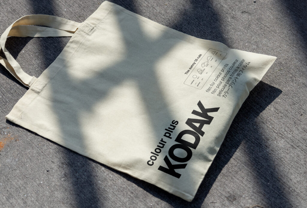
For this redesign, the focus is on strong typography and layout, using a plain colour palette that already resonates with Kodak.
The typeface that was used is Pretendard. It is a strong typeface with many different fonts. I adjusted the tracking so the letters are closer together in the logo, giving it a slightly more artsy and modern feeling.


Packaging design
The first thing you will see on the box is an orange blur. This is inspired by light leaks that are very present in film photography. It is a strong visual cue to this while being subtle at the same time.
Every type of film will have a different colour blur to distinguish the different types.


Do you also have a project like this?
Let’s work together to bring your brand to life!


