NARU cafe Branding
Branding Feb 2024
Brief
Create branding for a Korean / Indian fusion restaurant
Role
Designer for client project
About NARU
NARU reached out to me to work together on their branding. The premise was to create a brand that is minimal yet impactful and gives a luxurious feeling.
The brand was just starting out so they needed something that would set them apart in the market and also the area where the restaurant would be located.
We worked closely together on this project, to create branding that would do all of the above.
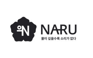
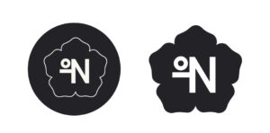
Restaurant logo
NARU is a cafe focused on quality, from its culinary offering to serene ambience that resonates with with the stillness of deep waters, providing guests with a peaceful escape from their everyday life.
The reference of ‘stillness of deep waters’ comes back in the Korean text, which translates to: the deeper the water, the less sound.
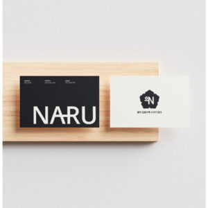
Since the cafe focuses on Korean cuisine with Indian influences, I wanted to represent Korean culture a lot. That’s why the brand mark consists of a flower that is often found in dancheong: Korean paintings on temples. It is a subtle reference and adds a more approachable atmosphere to the look & feel of the brand.
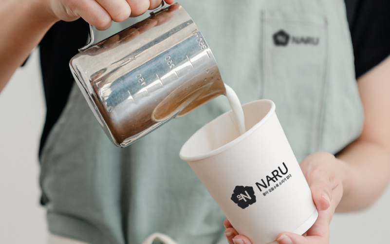
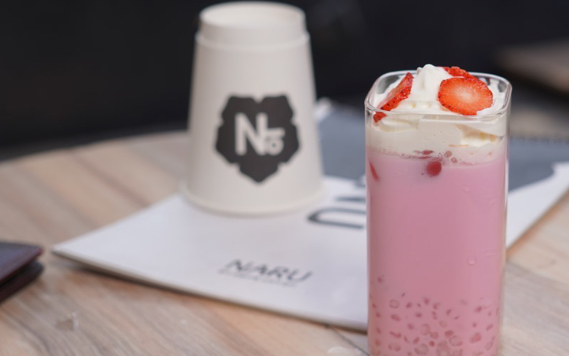
Restaurant merch & collateral
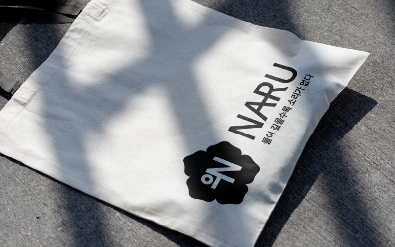
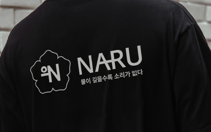
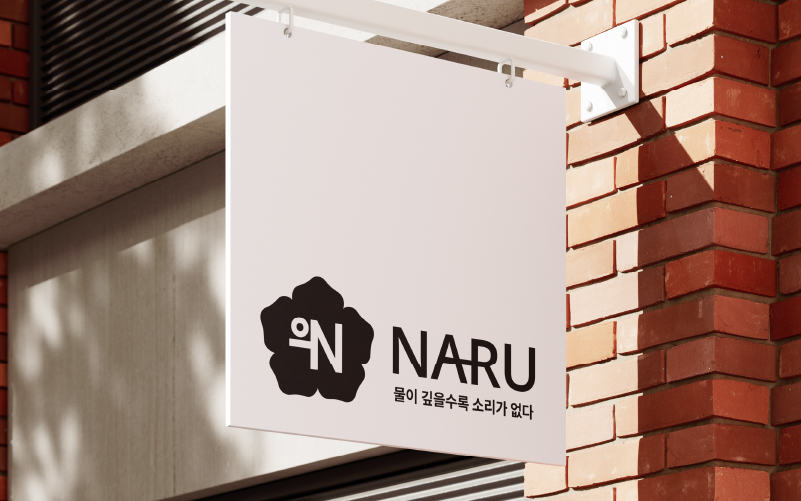
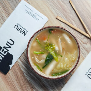
In the deliverables, business cards, merch design, and signage were included.
Since the Korean culture would be an important aspect of the brand, I wanted to clearly represent in most of the misc. Therefore, the Korean tagline is visible everywhere, it became an inherent part of the brand.
Though everything was to be kept very minimal while still being impactful. That is where I also often put the dancheong flower to use, as one of the major brand assets.
*please note that the menu design itself was designed by another agency. & the design was only responsible for the branding.
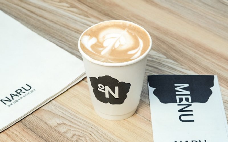
Restaurant visuals
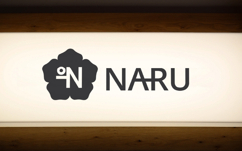
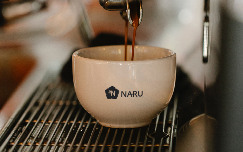
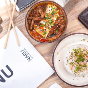
Continuing the minimal and luxurious style into the restaurant visuals. In all application of the branding, the focus should be on minimalism and the strong shapes that are already present in the logo lockup.
Therefore, the brand colours are very neutral as well. Consisting of a cream colour combined with a charcoal, raisin black. This contributes to a luxurious feeling for the brand.


Restaurant logo
NARU is a cafe focused on quality, from its culinary offering to serene ambience that resonates with with the stillness of deep waters, providing guests with a peaceful escape from their everyday life.
The reference of ‘stillness of deep waters’ comes back in the Korean text, which translates to: the deeper the water, the less sound.
Since the cafe focuses on Korean cuisine with Indian influences, I wanted to represent Korean culture a lot. That’s why the brand mark consists of a flower that is often found in dancheong: Korean paintings on temples. It is a subtle reference and adds a more approachable atmosphere to the look & feel of the brand.


Restaurant merch & collateral
In the deliverables, business cards, merch design, and signage were included.
Since the Korean culture would be an important aspect of the brand, I wanted to clearly represent in most of the misc. Therefore, the Korean tagline is visible everywhere, it became an inherent part of the brand.
Though everything was to be kept very minimal while still being impactful. That is where I also often put the dancheong flower to use, as one of the major brand assets.
*please note that the menu design itself was designed by another agency. & the design was only responsible for the branding.


Restaurant visuals
Continuing the minimal and luxurious style into the restaurant visuals. In all application of the branding, the focus should be on minimalism and the strong shapes that are already present in the logo lockup.
Therefore, the brand colours are very neutral as well. Consisting of a cream colour combined with a charcoal, raisin black. This contributes to a luxurious feeling for the brand.


Do you also have a project like this?
Let’s work together to bring your brand to life! Email me at iris@andthedesign.nl or


