Alexa Photographer Branding
Branding & art direction Feb 2023
Alexa Photographer Branding
Branding & art direction Feb 2023
Brief
Create the branding for a photographer. Include layout design for a photography zine and merchandise.
Role
Designer + art direction + packaging
About the photographer
Alexa is a hobby photographer at the moment but wanted branding that reflects her as a photographer. This is because she wants to take photography more seriously and needs branding to really start her journey in this art.
We discussed the project and we decided to create general branding that she can also use per photography project, while she keeps her brand identity and recognisability.
Logo design
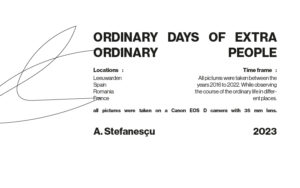
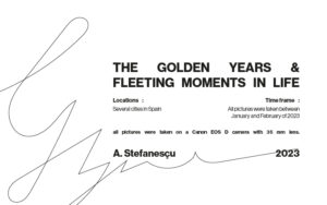
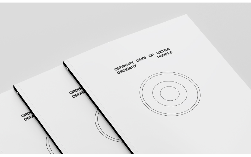
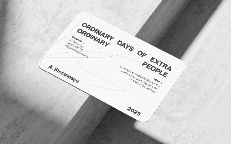
The logo serves the purpose of a stamp. The layout remains the same for each of her projects, just the words change. This stamp idea comes from the idea that her photography is very centred around a specific subject and the stamp only serves to create recognisability without taking the centre stage. We wanted the focus to completely be on the photography, in its most pure form.
I used the Neue Haas Grotesk typeface in bold and medium font to create contras as well as balance in the logo lockup. The lockup is completed with some sketch lines that represent the chaos that we encounter in daily life – this is also reflected in the pictures. The clean type and the sketch lines show the contrast in balancing chaos with calm and simplicity.
Layout design
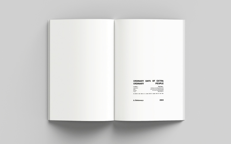
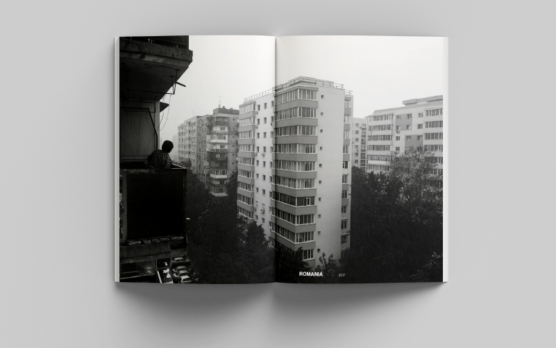
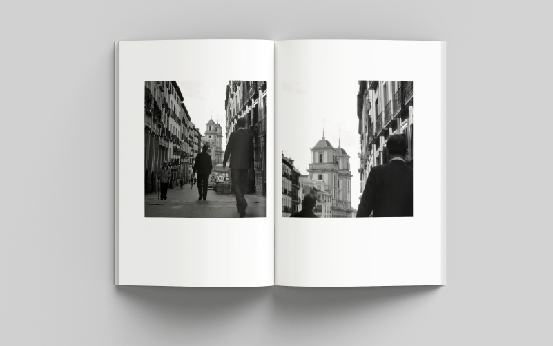
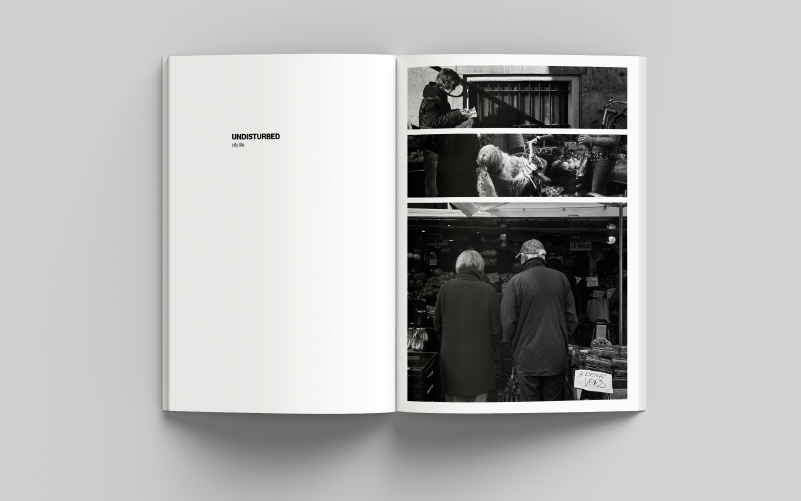
For the layout for the photography zine, the focus was on the photography. By cropping certain areas of an image to shift the focus, to splitting a page into clear grids, to adding text that resonates with the images. By using contrast on the page layout, the focus is on the beauty of the images only.
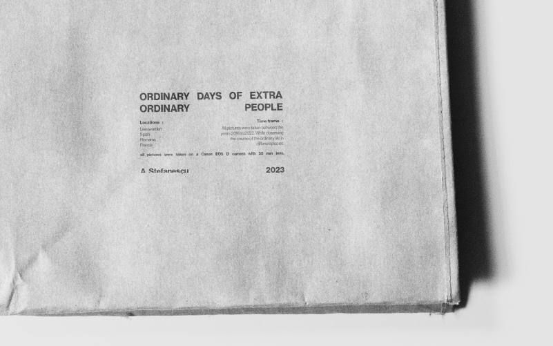
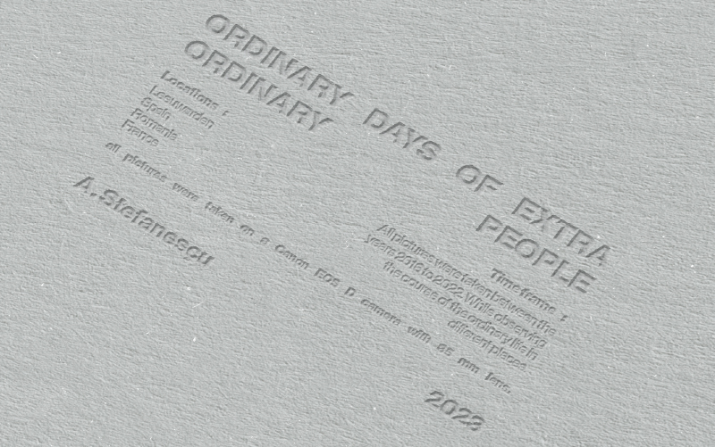
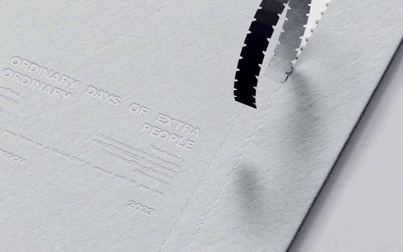
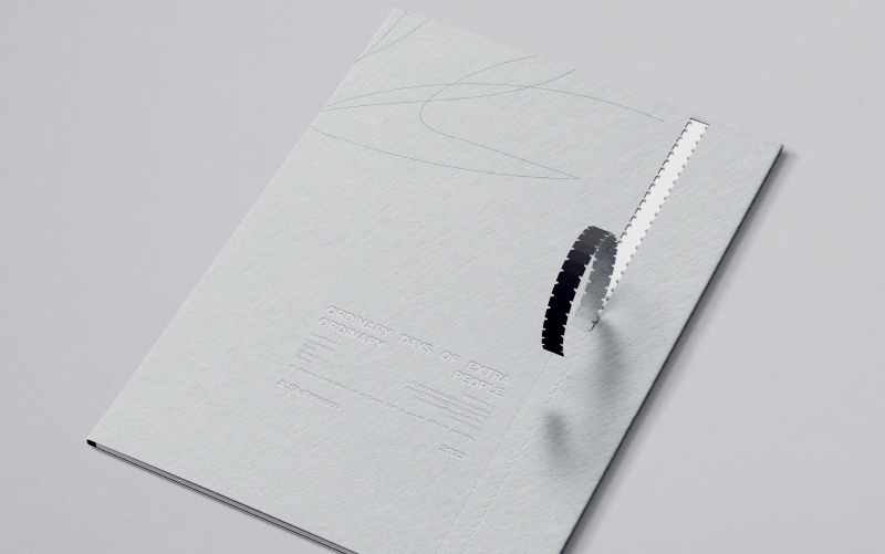
The cover of the booklet also plays an important part in reflecting the branding and the art direction. To create an experience when buying the zine, I added a cover where you have to rip it open to get the actual product. This cover has the lockup embossed on it.
Merchandise design
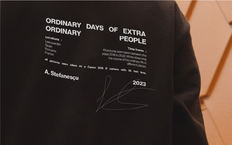
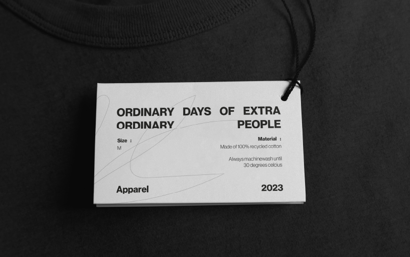
With some additional merchandise design, Alexa is set with a consistent branding. All elements can easily be altered when there is a new project released by her, which makes the branding flexible and adaptable to new releases.


Logo design
The logo serves the purpose of a stamp. The layout remains the same for each of her projects, just the words change. This stamp idea comes from the idea that her photography is very centred around a specific subject and the stamp only serves to create recognisability without taking the centre stage. We wanted the focus to completely be on the photography, in its most pure form.
I used the Neue Haas Grotesk typeface in bold and medium font to create contras as well as balance in the logo lockup. The lockup is completed with some sketch lines that represent the chaos that we encounter in daily life – this is also reflected in the pictures. The clean type and the sketch lines show the contrast in balancing chaos with calm and simplicit


Layout design
For the layout for the photography zine, the focus was on the photography. By cropping certain areas of an image to shift the focus, to splitting a page into clear grids, to adding text that resonates with the images. By using contrast on the page layout, the focus is on the beauty of the images only.
The cover of the booklet also plays an important part in reflecting the branding and the art direction. To create an experience when buying the zine, I added a cover where you have to rip it open to get the actual product. This cover has the lockup embossed on it.


Merchandise design
With some additional merchandise design, Alexa is set with a consistent branding. All elements can easily be altered when there is a new project released by her, which makes the branding flexible and adaptable to new releases.
