Cafe branding
The Cherry Nook
Branding Feb 2023
Brief
Passion project to create cafe branding + packaging design for their signature coffees
Role
Designer for a passion project
About The Cherry Nook
Tucked away in a nice part of town, The Cherry Nook is a study cafe that provides a calm place to work and study, while enjoying a mean cup of coffee. The concept of the cafe is that it is both friendly, welcoming, but also organised so that you can peacefully study there, without many distractions.
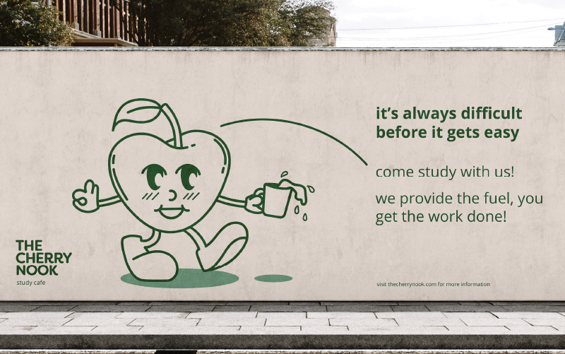
For this reason, the art direction is simple yet strong. The cafe needs to be recognisable beyond just its visuals. Its tone of voice should also make an impact. This is why I went for a motivational and welcoming tone that motivates people to study or work there.

Cafe logo
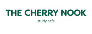
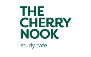
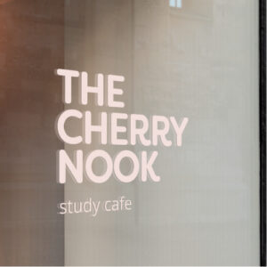
For the word mark, I used a strong font that has some funky features. Filson was the perfect fit. The characteristic finials at the end of certain characters, make the font very unique. The upper case font looked the best for this project and also makes a strong impact.
To make the word mark friendlier and more approachable, I adjusted the type to be a bit more rounded. It also adds to a bit more of a handwritten feel, which resonates with the brand since it’s a study cafe.
I paired this main font with Open Sans as the secondary font, because it creates a nice contrast due to it’s clean and nicely shaped letters. But it still has that friendly look.
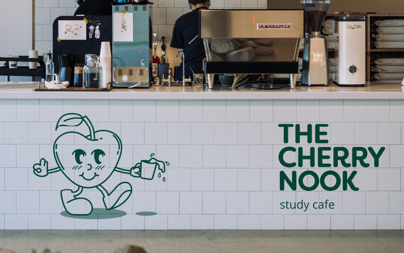
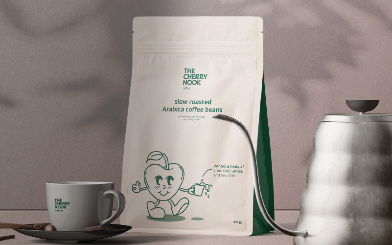
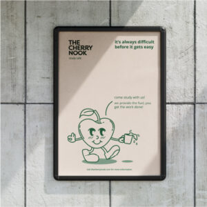
The word mark is accompanied by an illustration of a cherry, which serves as the brand mark + the brand mascot. It makes the cafe feel even more friendly and welcoming. For advertising, this illustration is great to use to highlight things such as ingredients or CTAs.
Study cafe external & internal branding
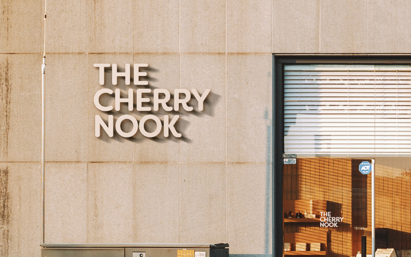
To maximise the welcoming, cosy, yet motivating look & feel of the cafe, I decided to use neutral colours. The touch of green adds to a bit more of a serious atmosphere but is contrasted with a fun type, illustrations, and the warmer cream colour. This makes the place very motivating and organised.
The approach for this cafe branding was very minimalistic yet focused on a maximum impact. It is a big industry so it is more important than ever to stand out. Not just in terms of concept, but especially in terms of branding.
Coffee bag design & collateral
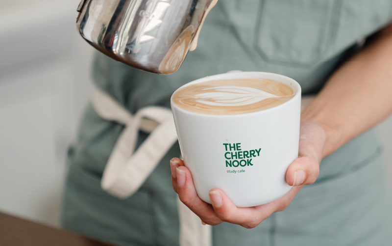
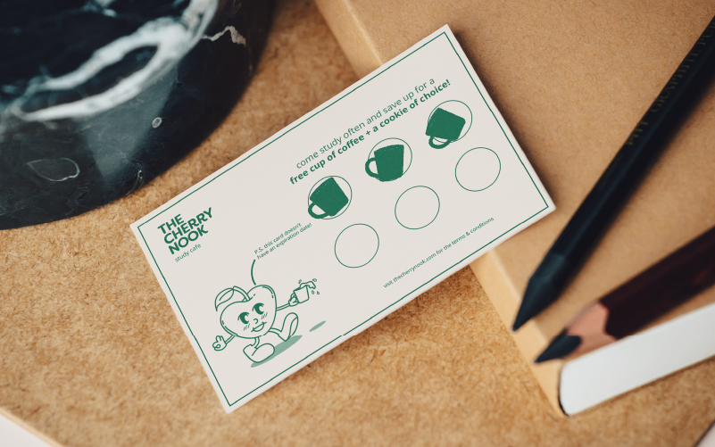
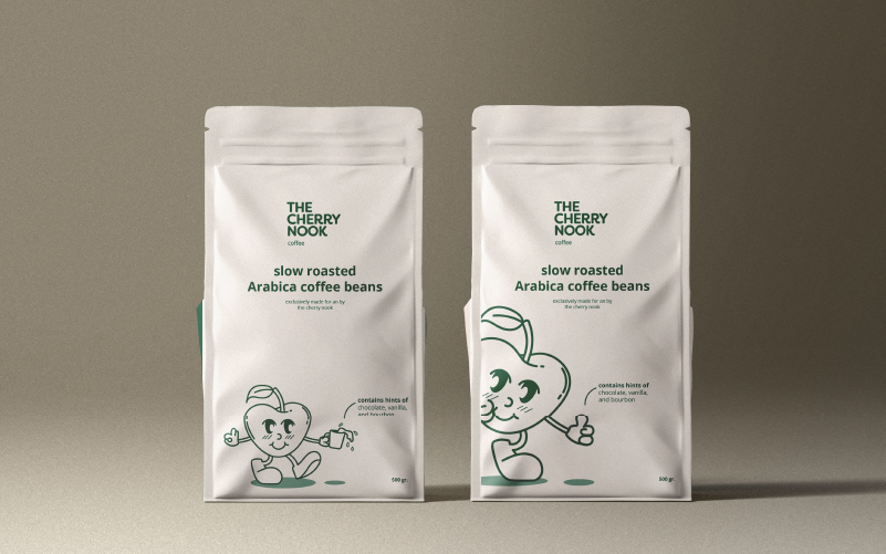
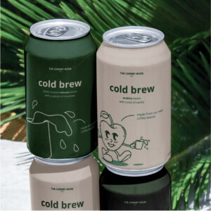
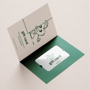
Illustrations are one of the iconic, recurring aspects of this branding. The main illustration is the cherry. As long as the style is the same, other illustrations can also be made. The coffee bags, gift cards, loyalty cards, cups, are all immediately recognisable because of the illustrations and the colour combination.
Green is used as primary colour because – according to colour psychology, it evokes a feeling of peace and rest. These are two things that are essential if you want to study effectively.



Cafe logo
For the word mark, I used a strong font that has some funky features. Filson was the perfect fit. The characteristic finials at the end of certain characters, make the font very unique. The upper case font looked the best for this project and also makes a strong impact.
To make the word mark friendlier and more approachable, I adjusted the type to be a bit more rounded. It also adds to a bit more of a handwritten feel, which resonates with the brand since it’s a study cafe.
I paired this main font with Open Sans as the secondary font, because it creates a nice contrast due to it’s clean and nicely shaped letters. But it still has that friendly look.
The word mark is accompanied by an illustration of a cherry, which serves as the brand mark + the brand mascot. It makes the cafe feel even more friendly and welcoming. For advertising, this illustration is great to use to highlight things such as ingredients or CTAs.


Study cafe external & internal branding
To maximise the welcoming, cosy, yet motivating look & feel of the cafe, I decided to use neutral colours. The touch of green adds to a bit more of a serious atmosphere but is contrasted with a fun type, illustrations, and the warmer cream colour. This makes the place very motivating and organised.
The approach for this cafe branding was very minimalistic yet focused on a maximum impact. It is a big industry so it is more important than ever to stand out. Not just in terms of concept, but especially in terms of branding.


Coffee bag design & collateral
Illustrations are one of the iconic, recurring aspects of this branding. The main illustration is the cherry. As long as the style is the same, other illustrations can also be made. The coffee bags, gift cards, loyalty cards, cups, are all immediately recognisable because of the illustrations and the colour combination.
Green is used as primary colour because – according to colour psychology, it evokes a feeling of peace and rest. These are two things that are essential if you want to study effectively.


Do you also have a project like this?
Let’s work together to bring your brand to life!


