Joy Sake
Branding June 2022
Joy Sake
Branding June 2022
Brief
Passion project to create branding and a label design for a sake brand
Role
Designer for a passion project
About Joy Sake
Sake is a traditional Japanese product and is made with relatively few ingredients. Though the process of making it, is rather complex and requires a lot of time – especially the waiting process.
This sake brand originates in Japan and has been using the traditional recipe for years now. They are looking to have their branding and label design, reflect their premium sake.
Logo design
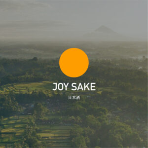
Japan is the land of the rising sun, this is represented by the yellow circle in the logo. However, using red seemed too obvious of a choice, so I chose yellow because it is a colour that is also often found in traditional woodblock paintings from Japan.
The primary font is DIN alternate bold with slight alterations. I paired this with trustworthy Futura to align with the sans serif nature of the logo lockup. The characters 日本酒 (sake) carry a very traditional style that appears more serif, which contrasts well with the rest of the logo.
Packaging design
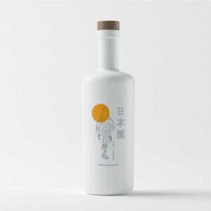
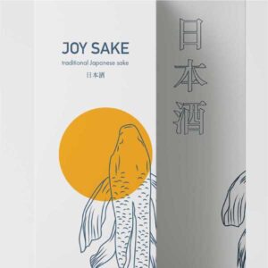
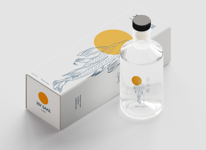
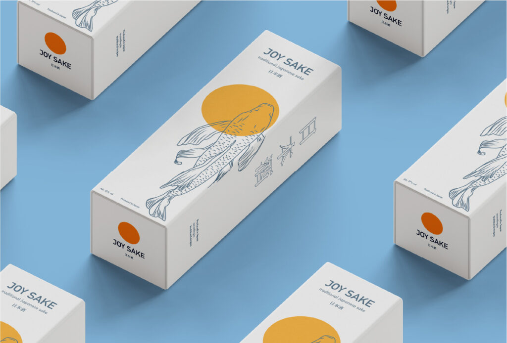
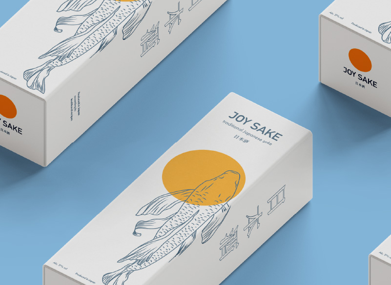
The brand produces traditional Japanese sake, which consists of few ingredients. The packaging of this product should reflect that at a glance. This is why I chose for a very simplistic packaging concept.
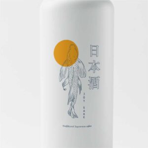
The koi is central since this is a species very reflective of Japan. The yellow rising sun concept also comes back in the design.
The Japanese characters that spell out ‘sake’ are on the side of the box, where the koi design continues, to tie everything together.

Poster design
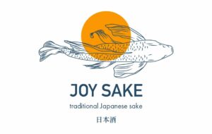
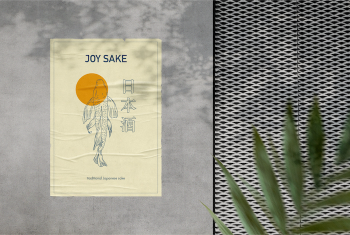
Every brand needs at least one poster design to use for social media or to do traditional advertising.
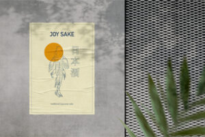
The brand needs to be reflected here as well, so I also took the simplistic and minimal approach here. The koi and the Japanese characters being central to the poster.


Packaging design
The brand produces traditional Japanese sake, which consists of few ingredients. The packaging of this product should reflect that at a glance. This is why I chose for a very simplistic packaging concept.
The koi is central since this is a species very reflective of Japan. The yellow rising sun concept also comes back in the design.
The Japanese characters that spell out ‘sake’ are on the side of the box, where the koi design continues, to tie everything together.


Poster design
Every brand needs at least one poster design to use for social media or to do traditional advertising.
The brand needs to be reflected here as well, so I also took the simplistic and minimal approach here. The koi and the Japanese characters being central to the poster.
