Temple Boba Cafe Branding
Branding Mar 2024
Brief
Create branding and packaging for a relaxing boba cafe
Role
Designer for client project
About Temple Boba
When Temple Boba reached out to me to work together on their branding, the premise was to create branding that fit the place being like a transcending experience, which, once people step inside, will immediately feel its tranquility. Allowing them an escape from the fast paced life, to slow down.
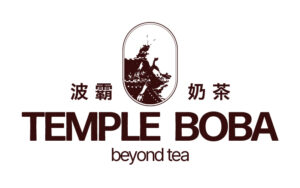
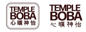
Cafe logo
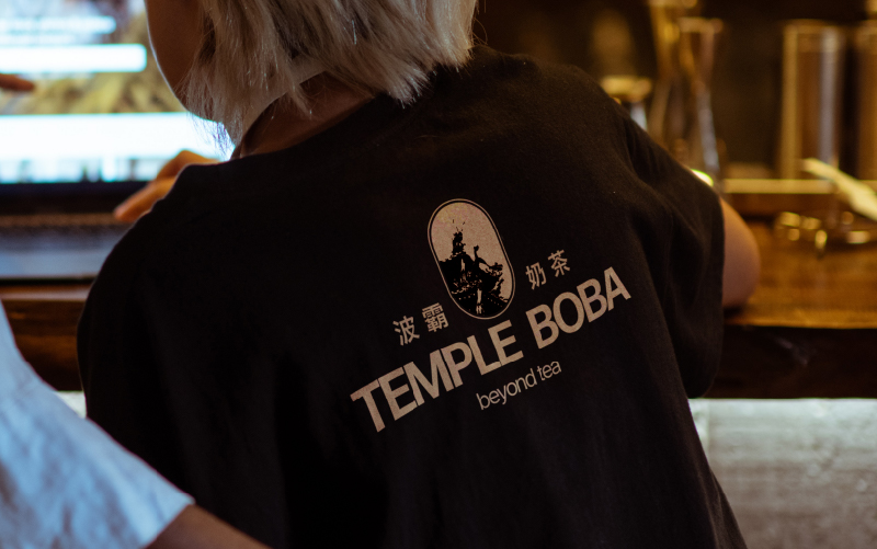
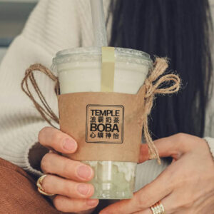
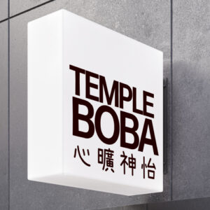
When we sat down to discuss the brand and its strategy, it became clear that the goal was really to stand out in client experience. Doing so by creating a relaxing, quiet, and calm experience for the guests. It was agreed that this calmer atmosphere should be very visible in the branding. Next to that, an important element to include was the contrast between traditional and modern. For this, we decided to focus on the origins of bubble tea to preserve the traditional feeling, and combining this more modern visuals. The visual is a temple in Taiwan – the place where bubble tea originated. The text in Chinese was specifically chosen as it refers to serenity and quiet, therefore fitting the brand perfectly.
Cards design
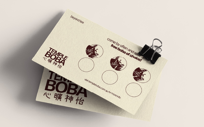
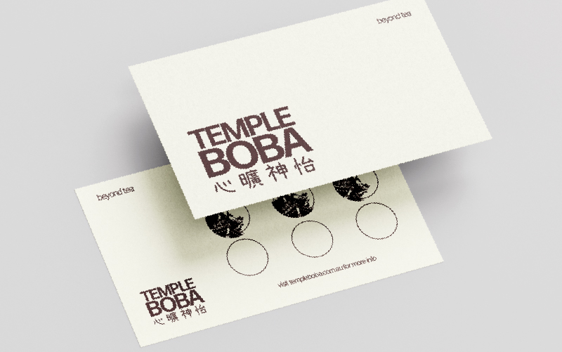
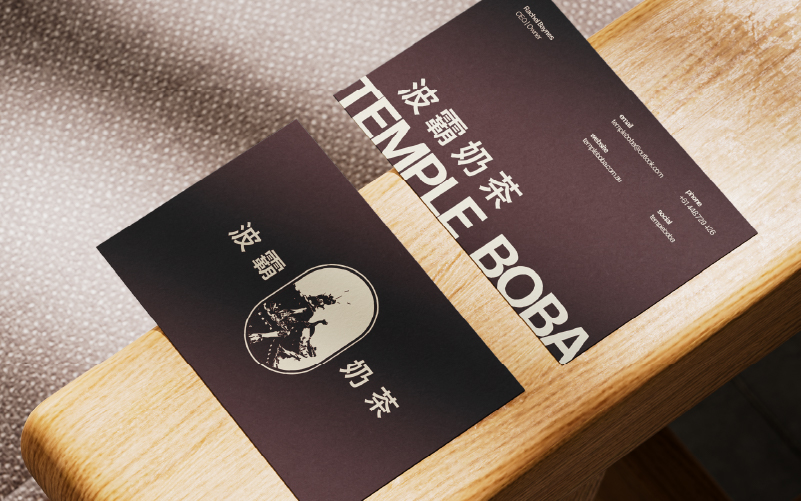
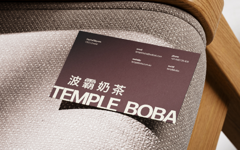
As part of the strategy, it was a great idea to create stamp cards, so that visitors would be more motivated to keep coming back. Next to that – as staple business visual – we created business cards. Although the idea was to make both cards complimentary each other, I wanted them to clearly stand out from each other all the same, so that people don’t get confused. The business card would be the luxurious, deep, lacquer brown colour and the stamp card would be the cream colour. This also makes it possible to put stamps on it.
Misc & merch
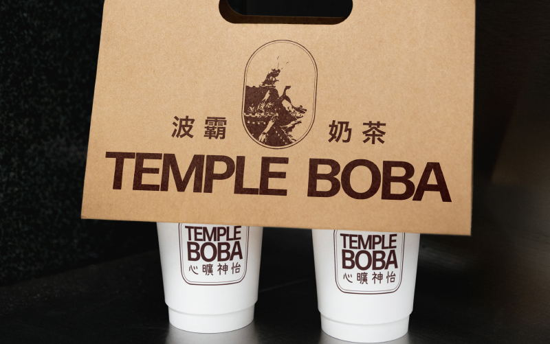
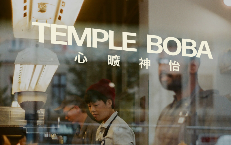
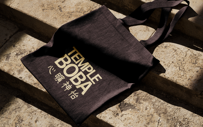
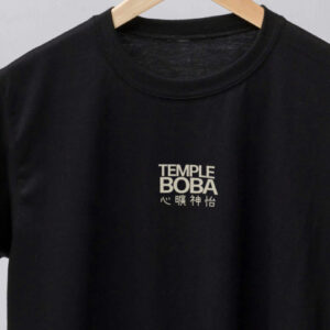
The minimal and tranquil atmosphere should be carried on through all the visuals of the brand. This also goes for all the merchandise as well. For the merchandise, I also wanted to keep a clear focus on the tagline, as it is an integral part of the brand. When thinking of the tagline, I found this idiom in Chinese and we agreed that it perfectly encapsulated the brand’s idea. The sentence says: xin kaung shen yi, which means: heart untroubled, spirit pleased, and relaxed.


Cafe logo
When we sat down to discuss the brand and its strategy, it became clear that the goal was really to stand out in client experience. Doing so by creating a relaxing, quiet, and calm experience for the guests. It was agreed that this calmer atmosphere should be very visible in the branding. Next to that, an important element to include was the contrast between traditional and modern. For this, we decided to focus on the origins of bubble tea to preserve the traditional feeling, and combining this more modern visuals. The visual is a temple in Taiwan – the place where bubble tea originated. The text in Chinese was specifically chosen as it refers to serenity and quiet, therefore fitting the brand perfectly.


Card designs
As part of the strategy, it was a great idea to create stamp cards, so that visitors would be more motivated to keep coming back. Next to that – as staple business visual – we created business cards. Although the idea was to make both cards complimentary each other, I wanted them to clearly stand out from each other all the same, so that people don’t get confused. The business card would be the luxurious, deep, lacquer brown colour and the stamp card would be the cream colour. This also makes it possible to put stamps on it.


Misc & merch
The minimal and tranquil atmosphere should be carried on through all the visuals of the brand. This also goes for all the merchandise as well. For the merchandise, I also wanted to keep a clear focus on the tagline, as it is an integral part of the brand. When thinking of the tagline, I found this idiom in Chinese and we agreed that it perfectly encapsulated the brand’s idea. The sentence says: xin kaung shen yi, which means: heart untroubled, spirit pleased, and relaxed.


Do you also have a project like this?
Let’s work together to bring your brand to life! Email me at iris@andthedesign.nl or


