Vietnamese restaurant Branding
Branding & packaging Aug 2023
Brief
Passion project to create branding + packaging for a Vietnamese restaurant
Role
Designer for a passion project
About Oooh Pho
Oooh Pho is a Vietnamese restaurant that has existed for several decades. They have the best pho recipe and it is therefore one of their staple dishes. However, they feel that they fail at attracting a younger generation to their restaurant.
The goal for this branding is to make sure the brand keeps their traditional feel but still manages to attract a younger generation.
Restaurant logo
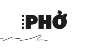
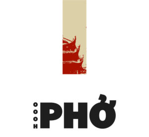
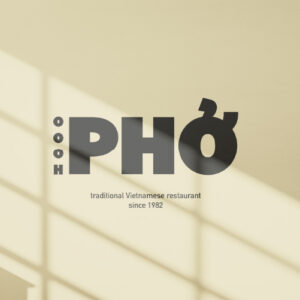
The brand should have a logo that is clear and immediately shows what the restaurant is all about. For this reason, I used a very bold typeface of Bilo in Black for the primary logo. The secondary typeface is DIN because of its friendly features.
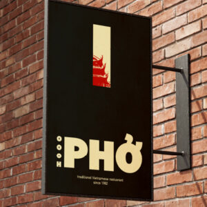
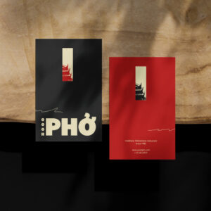
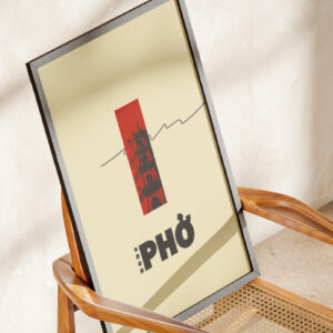
For the logo lockup, I combined the word mark with a squiggly line which represents the noodles in pho. The logo alternative uses the same word mark combined with a rectangle in which various pictures can be applied. It gives the idea of a stamp and creates a unique and luxurious feeling to the brand. It is also a great way of visually showing the Vietnamese culture.

Restaurant merch & collateral
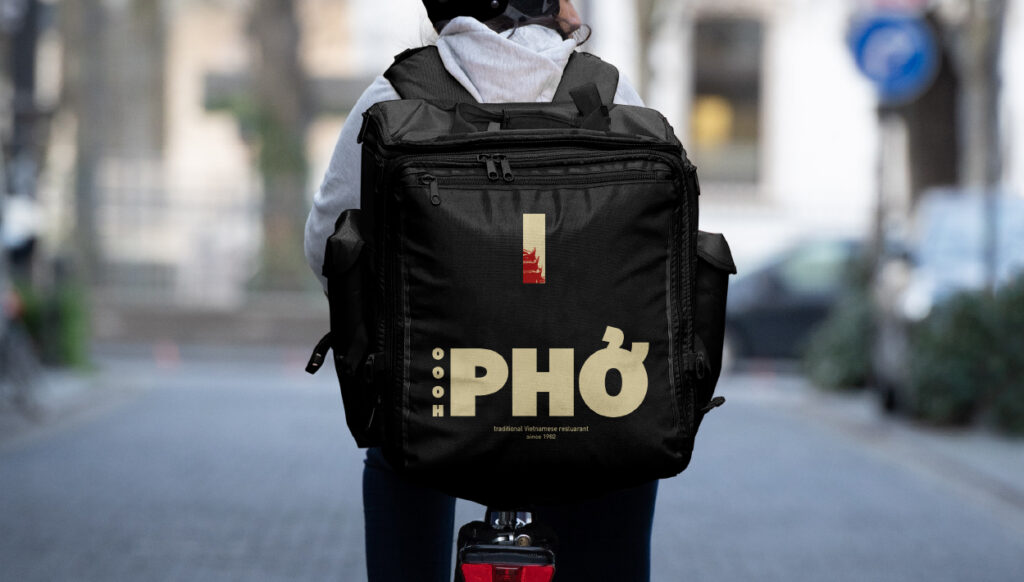
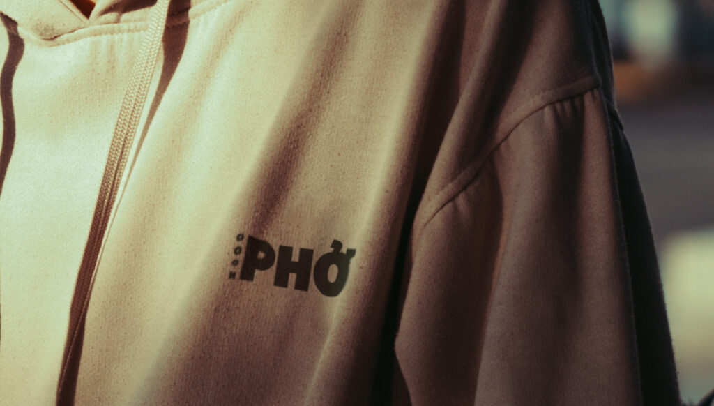
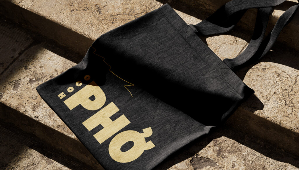
The restaurant’s branding is rather minimalistic, with a clear focus on typography and additional visuals. Along with a contrasting colour palette, this gives the brand a very luxurious feeling.
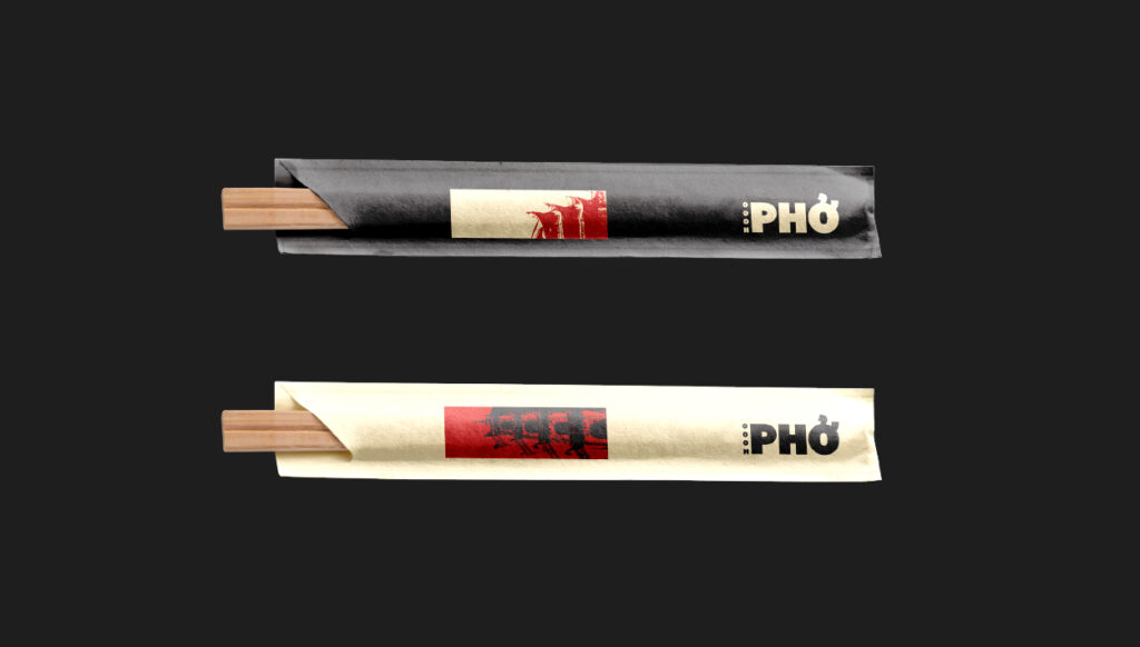
It is essential that this feeling and idea is conveyed in all of the brand visuals. For this reason, the merchandise primarily makes use of the bold typeface with the addition of various visuals of Vietnam with the threshold effect.
This approach makes the brand instantly recognisable while it still allows for some personalisation from time to time. Different pictures can be used in the rectangle in order to show different parts of the culture whenever needed.
All the brand visuals can be used with all three brand colours, interchangeably.
Restaurant visuals
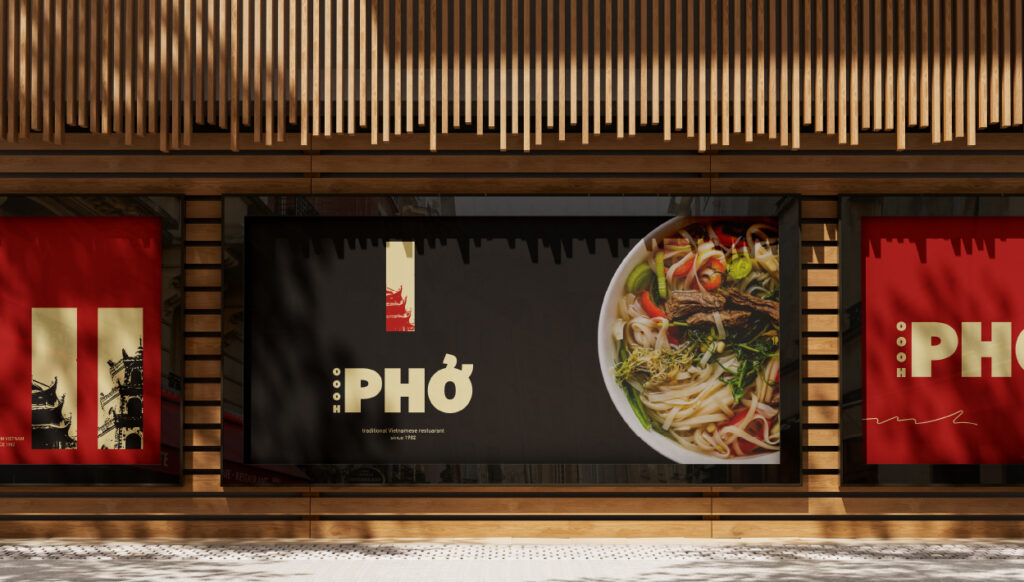
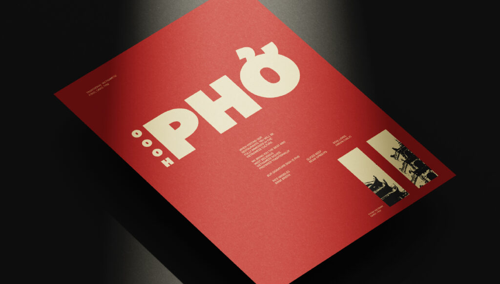
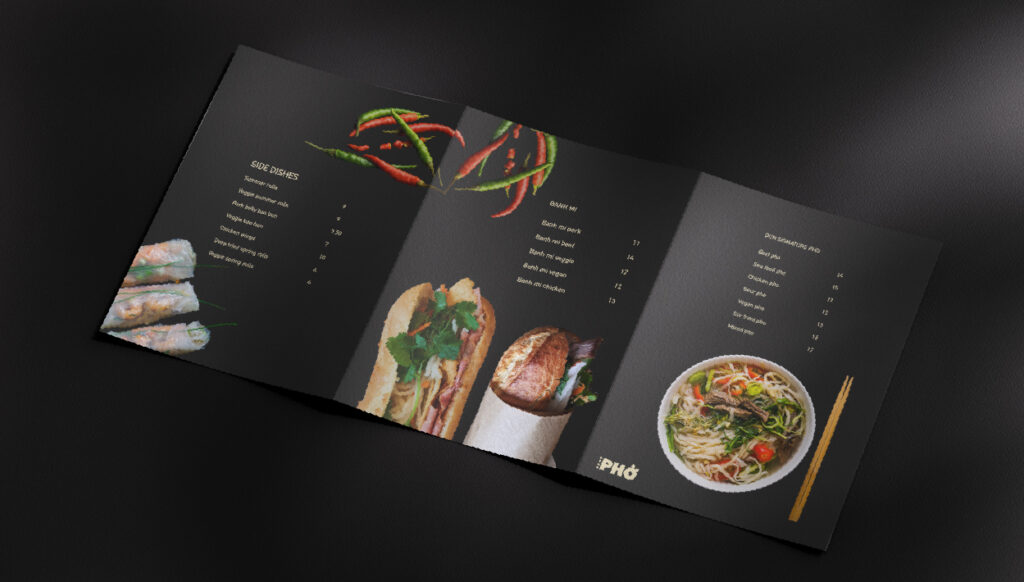
Continuing the luxurious and minimalistic style into the restaurant visuals. In the menu and poster designs, there is a clear focus on colour. All the parts that have food images are on the charcoal background in order for them to stand out and give the super luxurious feeling.
The rest uses a lot of red because it contrasts perfectly with charcoal. The pop of red adds life to the brand and, along with the yellow, also brings a bit of warmth.



Restaurant logo
The brand should have a logo that is clear and immediately shows what the restaurant is all about. For this reason, I used a very bold typeface of Bilo in Black for the primary logo. The secondary typeface is DIN because of its friendly features.
For the logo lockup, I combined the word mark with a squiggly line which represents the noodles in pho. The logo alternative uses the same word mark combined with a rectangle in which various pictures can be applied. It gives the idea of a stamp and creates a unique and luxurious feeling to the brand. It is also a great way of visually showing the Vietnamese culture.


Restaurant merch & collateral
The restaurant’s branding is rather minimalistic, with a clear focus on typography and additional visuals. Along with a contrasting colour palette, this gives the brand a very luxurious feeling.
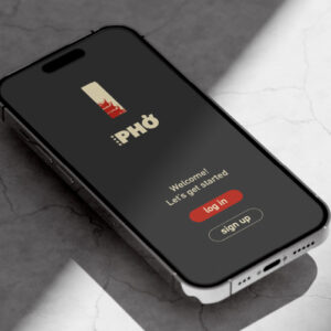
It is essential that this feeling and idea is conveyed in all of the brand visuals. For this reason, the merchandise primarily makes use of the bold typeface with the addition of various visuals of Vietnam with the threshold effect.
This approach makes the brand instantly recognisable while it still allows for some personalisation from time to time. Different pictures can be used in the rectangle in order to show different parts of the culture whenever needed.
All the brand visuals can be used with all three brand colours, interchangeably.


Restaurant visuals
Continuing the luxurious and minimalistic style into the restaurant visuals. In the menu and poster designs, there is a clear focus on colour. All the parts that have food images are on the charcoal background in order for them to stand out and give the super luxurious feeling.
The rest uses a lot of red because it contrasts perfectly with charcoal. The pop of red adds life to the brand and, along with the yellow, also brings a bit of warmth.


Do you also have a project like this?
Let’s work together to bring your brand to life!


