Candles & co.
Branding Sept 2022
Candles & co.
Branding Sept 2022
Brief
Passion project to create a luxurious soy wax candle brand
Role
Designer for a passion project
About Candles & co.
This brand is founded by an interior designer, which is reflected in the products the brand produces because they are made to add a touch of interior designer into your home.
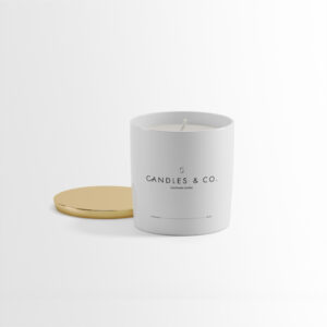
The candles come in different shapes and sizes and are made of soy wax. They are made with unique scents to add a nice atmosphere to your rooms.


Logo design
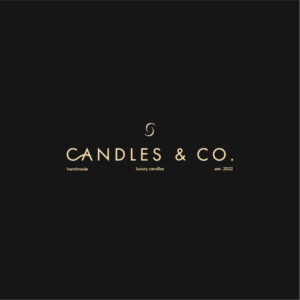
Since the brand is luxurious and sells interior design candles, the logo should clearly reflect this. The word mark is Futura in caps lock and I made a ligature between the ‘C’ and ‘A’ to reflect the traces of smoke that you see after blowing out a candle. It also adds motion to the design and guides the eyes through the word mark.
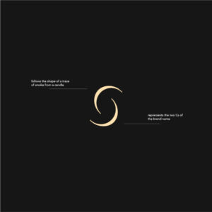
The same idea is also reflected in the brand mark. It is constructed by cutting an outlined circle in half, duplicating that, and reflecting the shape. The shape represents the two ‘c’s that make up the brand name but also reflect traces of smoke.
The primary font is paired with Avenir for the secondary font, with which the tagline has been written.

Brand assets
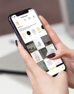
To maintain consistency of the brand through all vessels, I created a social media feed proposal. The posts are product focused and are there to reflect how well the packaging and product fits into interior focused houses.
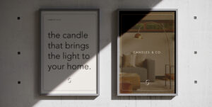
Next to the brand being present on online channels, it could also take the traditional advertising approach, for which I created 2 poster variations. The idea behind the posters is that they create consistency, so that when one glances over, they immediately recognise that it’s a ‘Candles & co.’ poster.
For this reason, I chose to provide the brand’s mission and combine that with interior based photography to reflect the setting in which the candles best come to life.


Packaging design
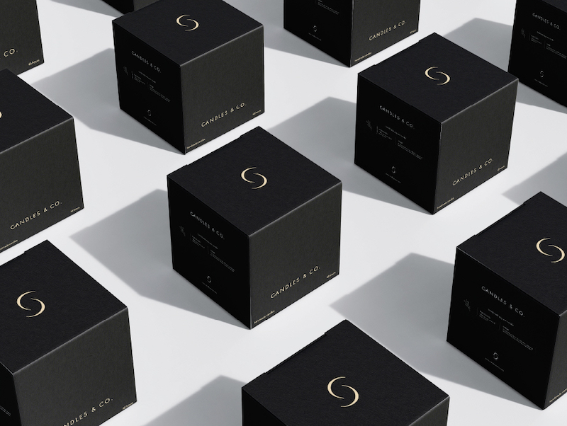
The most important aspect of this brand might be the packaging itself, since it should live up to the standards of an interior design product. For this reason, I chose to take a minimalistic approach and only put the necessary information on the box and keep the focus on the logo and brand mark.
Combining the gold details of the information on the packaging, with an almost black colour (or white, for variety), provides a nice contrast which makes gives the package design shelf presence.
This approach gives a lot of credit to the logo and brand mark, that come back on all sides of the box. Since the logo and brand mark are some of the main things that people will recognise this brand by, it’s important for them to take the main stage.


Brand assets
To maintain consistency of the brand through all vessels, I created a social media feed proposal. The posts are product focused and are there to reflect how well the packaging and product fits into interior focused houses.
Next to the brand being present on online channels, it could also take the traditional advertising approach, for which I created 2 poster variations. The idea behind the posters is that they create consistency, so that when one glances over, they immediately recognise that it’s a ‘Candles & co.’ poster.
For this reason, I chose to provide the brand’s mission and combine that with interior based photography to reflect the setting in which the candles best come to life.

Packaging design
The most important aspect of this brand might be the packaging itself, since it should live up to the standards of an interior design product. For this reason, I chose to take a minimalistic approach and only put the necessary information on the box and keep the focus on the logo and brand mark.
Combining the gold details of the information on the packaging, with an almost black colour (or white, for variety), provides a nice contrast which makes gives the package design shelf presence.
This approach gives a lot of credit to the logo and brand mark, that come back on all sides of the box. Since the logo and brand mark are some of the main things that people will recognise this brand by, it’s important for them to take the main stage.
