Korean Restaurant Branding
Branding June 2023
Brief
Passion project to create branding + packaging for a traditional Korean restaurant
Role
Designer for a passion project
About Taste of Korea
Taste of Korea is a traditional Korean restaurant. From serving street food to home made kimchi, they have it all. And to top it off, they even serve their own beer.
The goal for the art direction was to show the Korean culture in a more modern jacket. With this, I created a slightly luxurious feeling – especially with the rich blue colour – yet with an accessible atmosphere, where you are immersed in the Korean cuisine.


Restaurant logo
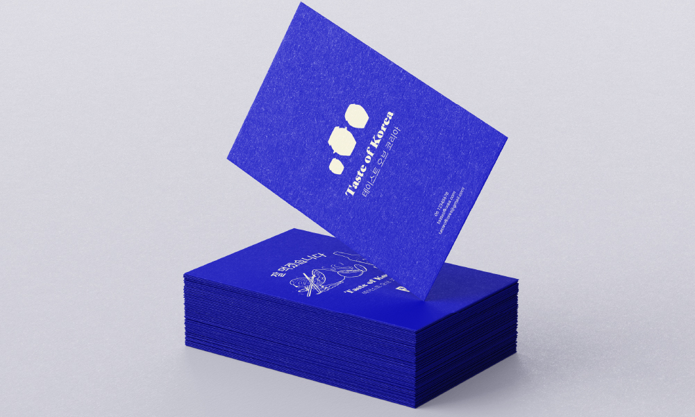
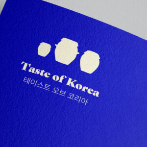
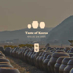
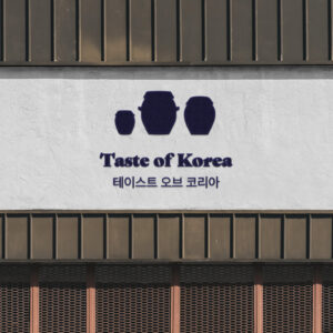
The brand mark for this restaurant depicts onngi (옹기). These are traditional Korean pots in which foods such as kimchi are stored. It is a big part of the Korean and have been used for centuries. For this reason, I wanted to use them for the brand mark.
The word mark is a strong font with serif features: Gastromond. It looks modern while still reflecting a slight vintage effect. Next to that, it gives the restaurant a bit more of a luxurious impress, which was exactly the goal.
I also wrote the restaurant name in Korean using the Pretendard font. It was important to do so since the goal of the brand was to be as authentically Korean as possible.
Restaurant external & internal branding
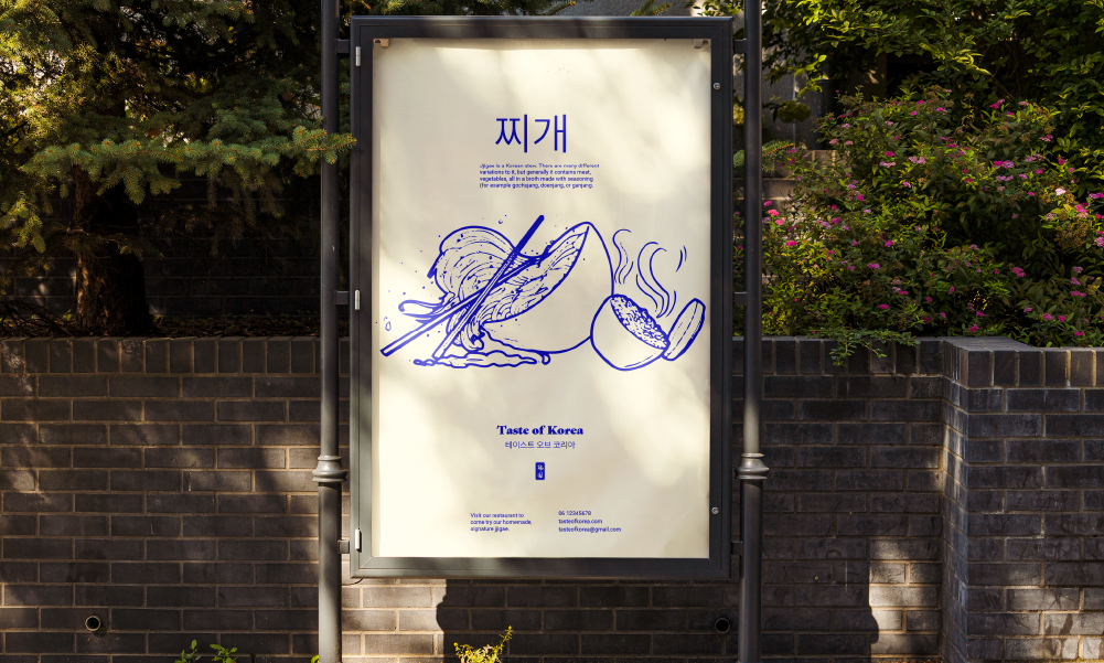
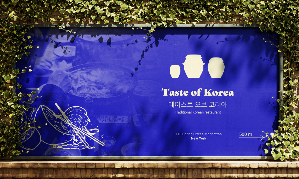
To create a refreshing feeling, I used a very bright blue as the primary colour. Combined with cream white, this creates a nice contrast. This colour palette adds to recognisability and a unique look.
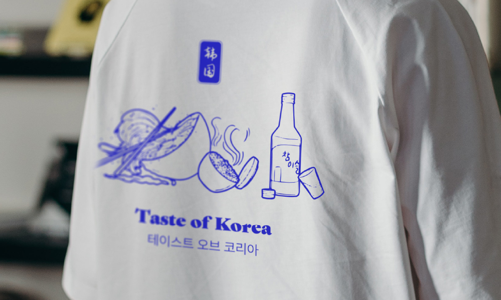
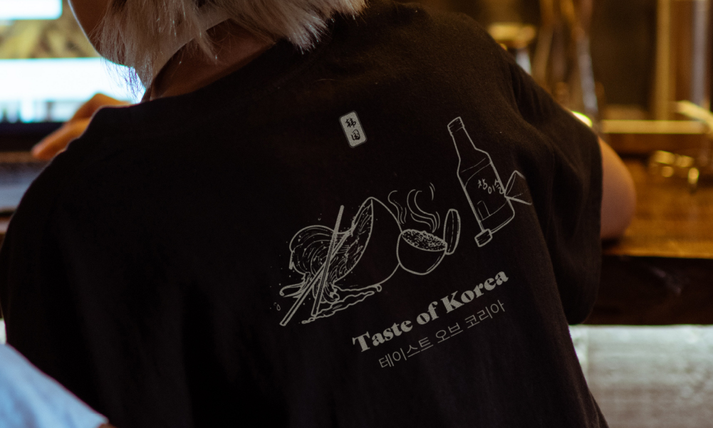
The use of the illustration both makes the restaurant more luxurious, accessible, and is greatly responsible for creating that traditional feeling that I wanted to convey. That is because the illustration is inspired by traditional paintings.
Creating a fusion of traditional and modern means that there needs to be a balance between each aspect. Going for a minimal approach to focus on the essence, is the best way to achieve this.
Restaurant packaging design & collateral
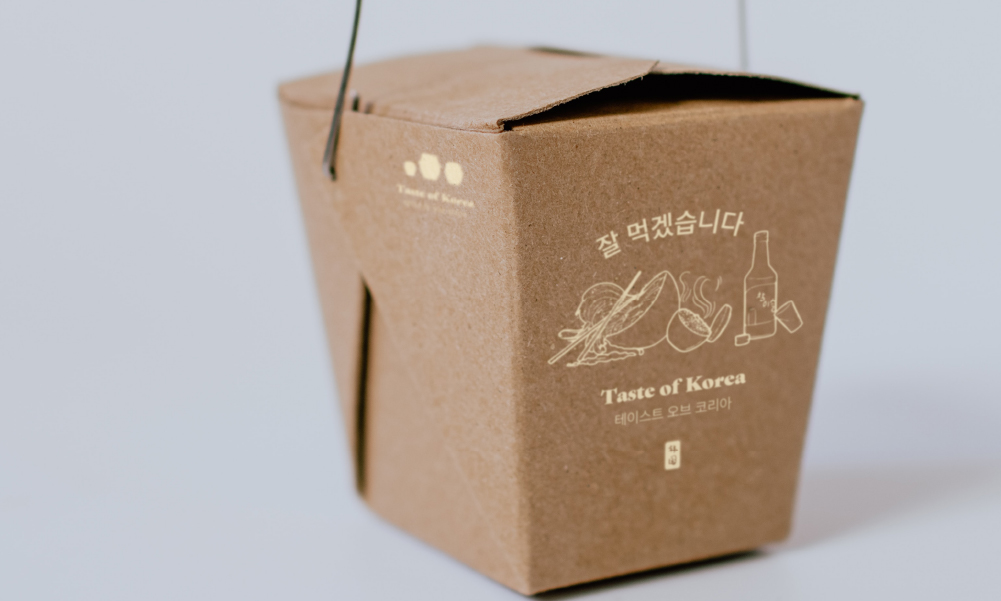
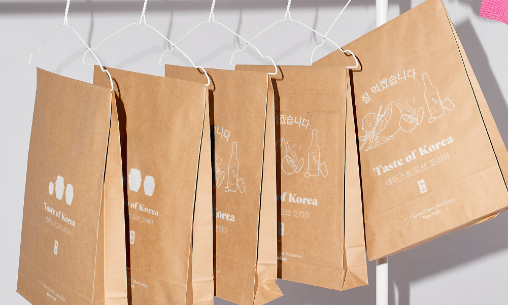
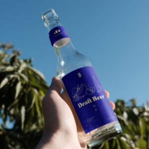
The illustration that accompanies the logo, is one of the iconic features of the branding. It is used on the beer packaging, on the merchandise, and even the business cards. It is a detailed illustration of the some of the most popular Korean food. Featuring a bottle of soju, a bowl of rice, and galbitang.
Throughout all the branding, the bright blue and cream white are used. The bright colours help to convey a refreshing feeling and create impact. These are therefore used everywhere.
Signature beer
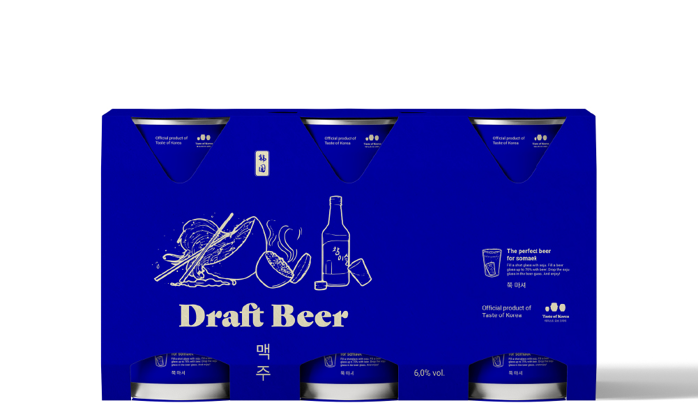
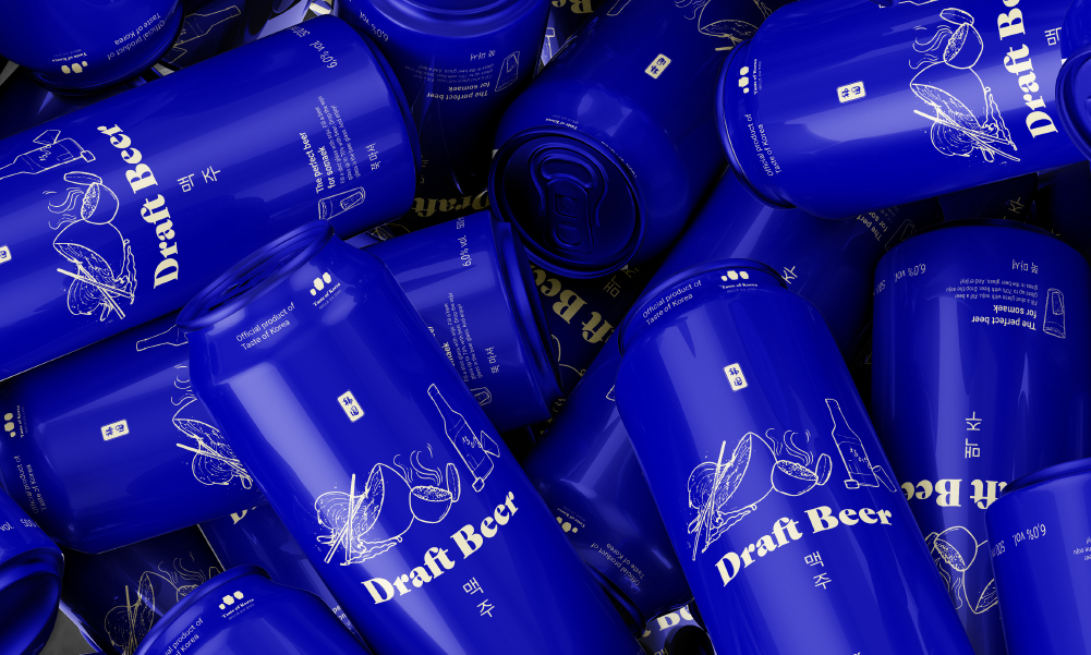
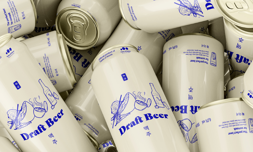
Since the restaurant has their own signature beer, this should accurately reflect the restaurant itself. Especially in case the beer will go to retail.
I used the illustration again on the front and made sure that if there will be different types of beer to be realised, the layout, colour, and style will make sure the beer is iconic for Taste of Korea.



Restaurant logo
The brand mark for this restaurant depicts onngi (옹기). These are traditional Korean pots in which foods such as kimchi are stored. It is a big part of the Korean and have been used for centuries. For this reason, I wanted to use them for the brand mark.
The word mark is a strong font with serif features: Gastromond. It looks modern while still reflecting a slight vintage effect. Next to that, it gives the restaurant a bit more of a luxurious impress, which was exactly the goal.
I also wrote the restaurant name in Korean using the Pretendard font. It was important to do so since the goal of the brand was to be as authentically Korean as possible.


Restaurant external & internal branding
To create a refreshing feeling, I used a very bright blue as the primary colour. Combined with cream white, this creates a nice contrast. This colour palette adds to recognisability and a unique look.
The use of the illustration both makes the restaurant more luxurious, accessible, and is greatly responsible for creating that traditional feeling that I wanted to convey. That is because the illustration is inspired by traditional paintings.
Creating a fusion of traditional and modern means that there needs to be a balance between each aspect. Going for a minimal approach to focus on the essence, is the best way to achieve this.


Restaurant packaging design & collateral
The illustration that accompanies the logo, is one of the iconic features of the branding. It is used on the beer packaging, on the merchandise, and even the business cards. It is a detailed illustration of the some of the most popular Korean food. Featuring a bottle of soju, a bowl of rice, and galbitang.
Throughout all the branding, the bright blue and cream white are used. The bright colours help to convey a refreshing feeling and create impact. These are therefore used everywhere.


Signature beer
Since the restaurant has their own signature beer, this should accurately reflect the restaurant itself. Especially in case the beer will go to retail.
I used the illustration again on the front and made sure that if there will be different types of beer to be realised, the layout, colour, and style will make sure the beer is iconic for Taste of Korea.


Do you also have a project like this?
Let’s work together to bring your brand to life!


