Perfume Branding
Branding April 2023
This project is mentioned as ‘Best Luxury Packaging Design 2023’ by Design Rush. Read the article here.
Brief
Passion project to create branding + packaging for a perfume brand
Role
Designer for a passion project
About Fleur
Fleur is a high end but simplistic perfume brand that cherishes nature in every aspect of their design. It is made for bringing hints of nature into a busy urban lifestyle.
For this reason, the perfume is made of natural ingredients and all scents are very subtle for it not to overwhelm. All in all, this makes the perfume very classy. The high-end, classy feeling should be communicated through the branding and packaging as well, which is the objective of this project.
Perfume logo
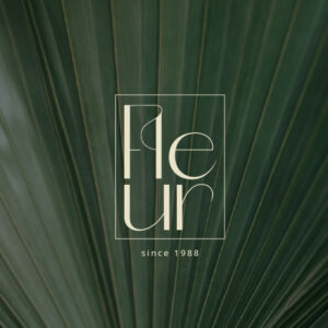
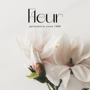
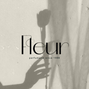
The word mark had to be special and recognisable because it will be used on all perfume bottles. For this reason, I decided to represent the ‘flow of nature’ by creating an actual flow through the word. Every character is in some way connected to each other through the thin line that you recurs throughout. The perfect typeface to achieve this with was Lust Sans in medium, because it has such graceful lines.
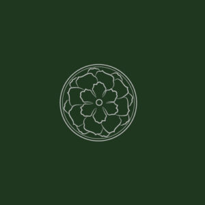
The word mark is accompanied by a floral symbol. This is a very fragile, detailed brand mark which I created to represent the fragility of nature. It also represents the complex process of developing the perfume for it to be so distinct and perfected.
Perfume packaging designs
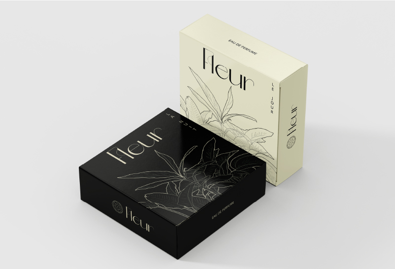
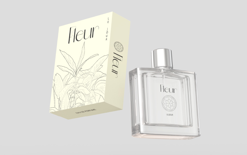
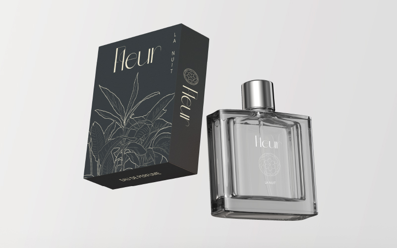
The perfume brand has 2 signature scents; one for at night and one for during the day. It was only right to represent these 2 scents properly.
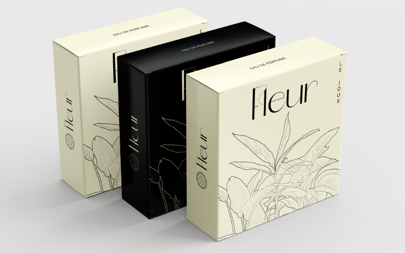
The day version ‘le jour’ has a very subtle yellow background, as if the sun is just rising. Contrastingly, the night version ‘la nuit’ has a black background and gives off a very luxurious feeling.
Each packaging has a detailed illustration of plants on it, to refer to the nature based ingredients and inspiration for the scents. It also adds to a more unique and luxurious feeling.
Design collateral
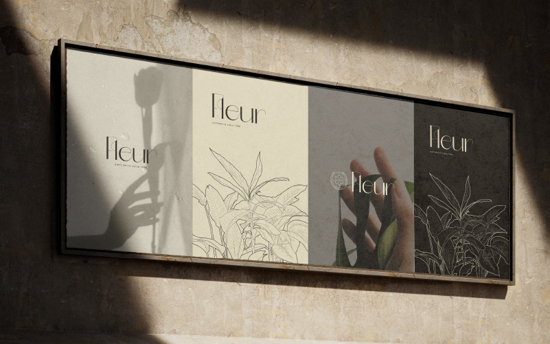
The essence of this brand is simplism, nature, calmness, and purity. To translate these aspects through all channels of the brand, I added poster designs for outdoor promotion. The nature photography in a subtle style are essential for translating this look and feel.
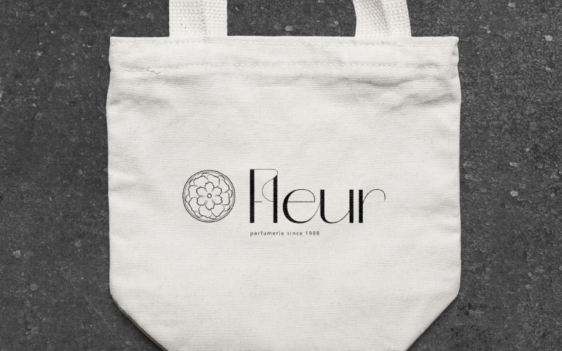
Lastly, I also added the logo to a bag to demonstrate the subtlety of the brand in mercandising as well.


Perfume logo
The word mark had to be special and recognisable because it will be used on all perfume bottles. For this reason, I decided to represent the ‘flow of nature’ by creating an actual flow through the word. Every character is in some way connected to each other through the thin line that you recurs throughout. The perfect typeface to achieve this with was Lust Sans in medium, because it has such graceful lines.
The word mark is accompanied by a floral symbol. This is a very fragile, detailed brand mark which I created to represent the fragility of nature. It also represents the complex process of developing the perfume for it to be so distinct and perfected.


Perfume packaging designs
The perfume brand has 2 signature scents; one for at night and one for during the day. It was only right to represent these 2 scents properly.
The day version ‘le jour’ has a very subtle yellow background, as if the sun is just rising. Contrastingly, the night version ‘la nuit’ has a black background and gives off a very luxurious feeling.
Each packaging has a detailed illustration of plants on it, to refer to the nature based ingredients and inspiration for the scents. It also adds to a more unique and luxurious feeling.


Design collateral
The essence of this brand is simplism, nature, calmness, and purity. To translate these aspects through all channels of the brand, I added poster designs for outdoor promotion. The nature photography in a subtle style are essential for translating this look and feel.
Lastly, I also added the logo to a bag to demonstrate the subtlety of the brand in mercandising as well.


Do you also have a project like this?
Let’s work together to bring your brand to life!


