The Jungle
Branding May 2022
The Jungle
Branding May 2022
Brief
Passion project to create a brand identity for a local plant nursery
Role
Designer
About The Jungle
The Jungle is a local plant nursery that pour their all into taking care of plants as well as growing the most beautiful plants. All in all, they have a strong passion for plants.
They needed branding that would reflect this passion and that would position them as a more high-end store.
Logo design
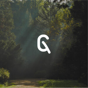
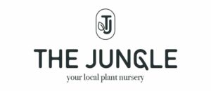
The process of creating the logo for this brand was quite a natural one. Knowing the brand has a deep love for plants, this had to be reflected in the logo as well. After brainstorming for a while for what typeface to use, I decided to go with one of my most trustworthy ones: DIN. To create a more welcoming feeling, I made the type rounded. This gave me the chance to manipulate the ‘G’ in such a way that it would look like a leaf – which reflects the brand’s love for plants; it’s integrated everywhere.
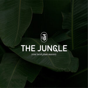
I combined the DIN with Bodoni, a majestic serif font. This lockup creates a slight luxurious, yet welcoming atmosphere.
The brand mark consists of the brand’s initials in a stamp-like shape. I added another leaf there to again reflect the brand’s love for plants.

Logo application
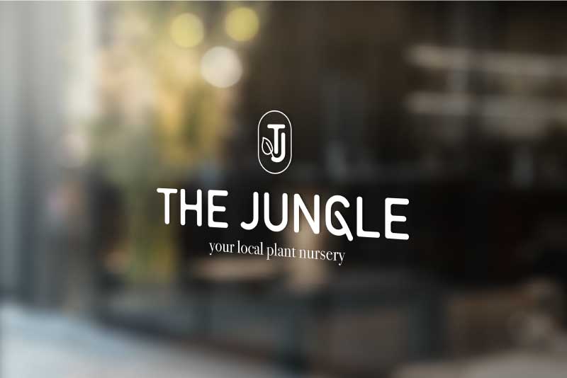
There are several places where the logo needs to be applied in a physical context. The store sign is the most important one.
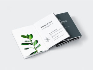
In addition, I created a booklet that explains every plant that the brand grows and provides steps on how to best take care of them. This adds to a unique feature that customers receive and positions the brand as experts in the field.
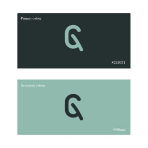
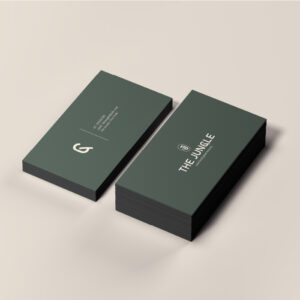
The colour scheme of the brand consists of a dark green combined with a minty green. This creates a good contrast and is consistent with the services and products the brand offers. These colours always come back in all the branding and application.


Merchandise design
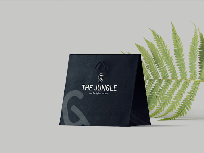
When people buy a plant from the store, the bag they carry with them, should reflect the brand and spark interest in those who see it on the street. I chose to use the deep green colour for the bag’s base colour since it gives off a more luxurious atmosphere.
I enlarged the ‘G’ brand mark and rotated it to make the mark easily recognisable and if people see it again, they would immediately know that it’s from The Jungle. The logo lockup and tagline are also clearly visible on the bag.


Logo application
There are several places where the logo needs to be applied in a physical context. The store sign is the most important one.
In addition, I created a booklet that explains every plant that the brand grows and provides steps on how to best take care of them. This adds to a unique feature that customers receive and positions the brand as experts in the field.
The colour scheme of the brand consists of a dark green combined with a minty green. This creates a good contrast and is consistent with the services and products the brand offers. These colours always come back in all the branding and application.

Merchandise design
When people buy a plant from the store, the bag they carry with them, should reflect the brand and spark interest in those who see it on the street. I chose to use the deep green colour for the bag’s base colour since it gives off a more luxurious atmosphere.
I enlarged the ‘G’ brand mark and rotated it to make the mark easily recognisable and if people see it again, they would immediately know that it’s from The Jungle. The logo lockup and tagline are also clearly visible on the bag.
