Fuji Ramen
Branding April 2022
Fuji Ramen
Branding April 2022
Brief
Passion project for an authentic, Japanese ramen restaurant
Role
Designer for a passion project
About Fuji Ramen
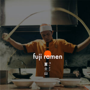
Ramen is a very popular and authentic dish in many areas in Asia, including Japan. This Japanese restaurant has been making their own traditional Japanese ramen by hand for many years.
They are expanding their business abroad as well and need branding to reflect their traditional origins while still being appealing and inviting to the global market.
Logo design
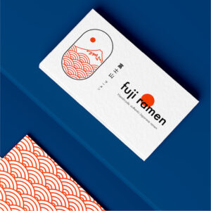
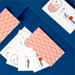
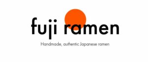
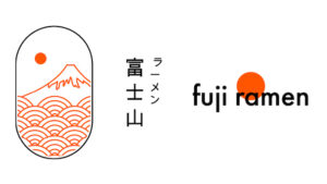
For this logo, I chose to use the Futura typeface in lower case for the entire logo lockup. This is combined with an orange circle that partially cuts through the word mark. The circle represents the land of the rising sun.
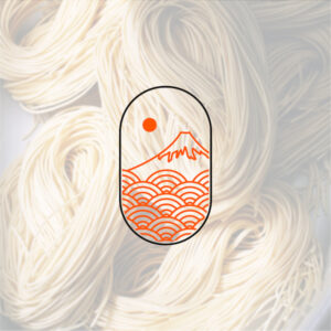
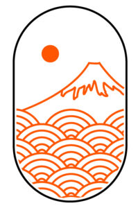
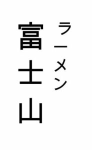
The brand mark is an illustration inspired by ukiyo-e wood block paintings. It depicts abstract water (that simultaneously also represents abstract ramen) and Mount Fuji. To maintain the authentic atmosphere of the restaurant in the branding, the name of the brand is also written out in Japanese 富士山.


Take away packaging
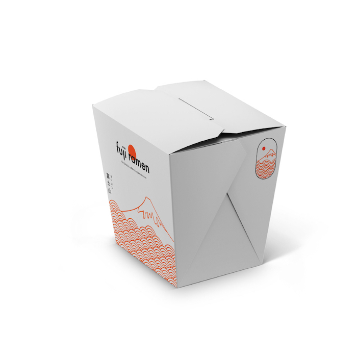
As a restaurant, the business also wants to focus on take away service. For this reason, I designed a box design that goes in line with the rest of the brand.
Using a circular pattern to segment the bottom, creates the illusion of both abstract ramen and waves. This is combined with Mount Fuji. The brand mark is added as a stamp on the side of the packaging.

Additional packaging
To differentiate but also align the packaging design of the restaurant’s signature brand, the secondary brand colour blue was used.
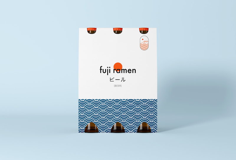
The orange in the waves/ramen was switched out with a deep blue colour, which nicely contrasts with the signature bright orange. This brand pattern was used at the bottom of the beer 6-pack. The logo is again clearly present and the content is written in Japanese, to add to its authenticity.
Lastly, the brand mark is added at the top right as a stamp.


Take away packaging
As a restaurant, the business also wants to focus on take away service. For this reason, I designed a box design that goes in line with the rest of the brand.
Using a circular pattern to segment the bottom, creates the illusion of both abstract ramen and waves. This is combined with Mount Fuji. The brand mark is added as a stamp on the side of the packaging.


Additional packaging
To differentiate but also align the packaging design of the restaurant’s signature brand, the secondary brand colour blue was used.
The orange in the waves/ramen was switched out with a deep blue colour, which nicely contrasts with the signature bright orange. This brand pattern was used at the bottom of the beer 6-pack. The logo is again clearly present and the content is written in Japanese, to add to its authenticity.
Lastly, the brand mark is added at the top right as a stamp.
